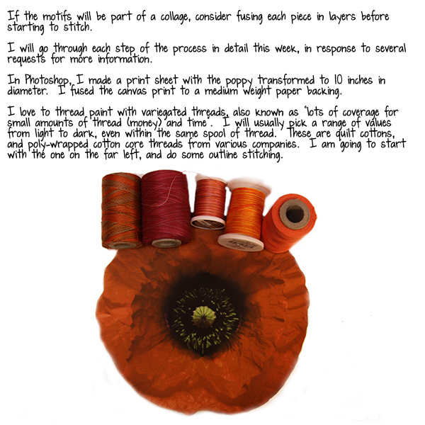
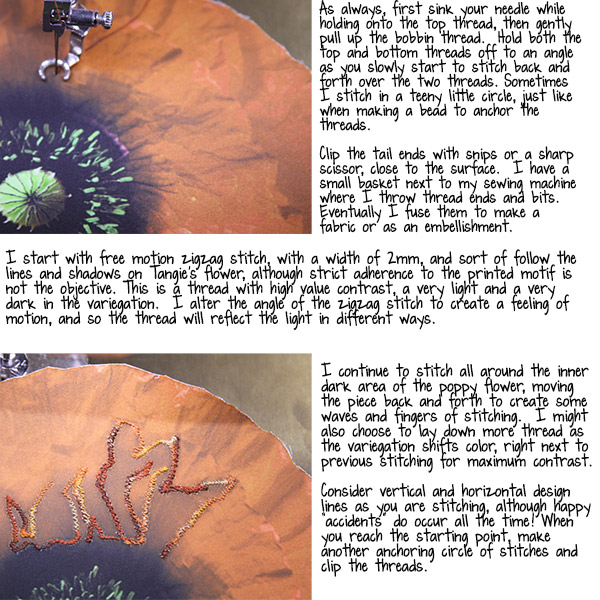
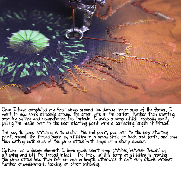
A few years back we had a feature called "Art Travels with Rain". Please note these may be altered from the original posts to update links, provide information on newer programs, etc.
Enjoy!

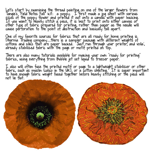
Hello all,
Today I am going to post for both this week and next as 11/27 is the day before Thanksgiving here in the US…our daughter’s family is coming from Hawaii tomorrow to spend the week with us in western Colorado and are all hoping for snow. Yes, my sweet almost 2 month old grandson is coming with Mom and Dad for Grandma Rain to take a few thousand more photos of his beautiful baby-ness! Maybe I will recover from overwhelming grandparent mania, by oh, age 18 or so, but then again, maybe not. It will just be another phase.
These two lessons are about using a paperback book to make a 3-D card or desk topper. There are so many paperback books available at library and tag sales for practically nothing…I have a small box of books I’ve picked up at the library sales for 5-10 cents, along with some hardbacks to make altered books for less than $1. I occasionally match the topic of the book to the actual card recipient, but more about this later.
Here are two images of finished paperbacks, one is a card for a dear friend and colleague battling fourth stage breast cancer, and the other lives on my desk in my studio:


Let’s first look at the mechanics of making the paperback into a card base.
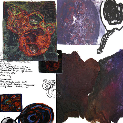
This is all about folding. First step, using a craft knife, cut off both the front and back covers of the book. I often save these to use as backing for some of the tidbits I push between the pages later, or you can just toss into your recycling bin.

This particular book is about playing Scrabble, and has special meaning for my friend as playing online while receiving chemotherapy infusions has helped her keep her sanity. I loved the paper of this book, but honestly it was such a lousy Scrabble guide I had no qualms about tearing the covers off and folding the pages into my card base.

When every page is folded in half to the center of the book spine, the base will form as a gentle arc. There are many variations to this shape that are easily folded, including:
*Folding each page at a different height for a stair step look, starting over again with the smallest size every 5 or so pages
*Cutting and Folding in a stairstep from small to large, then continuing from the peak, folding back to the smallest.
*Folding partial pages into triangles, rectangles, squares, or any other shape desired.
*Folding and cutting to form an organic or geometric pattern
*Folding and cutting to create a landscape or cityscape
*The sky is the limit!
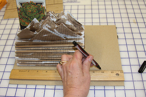
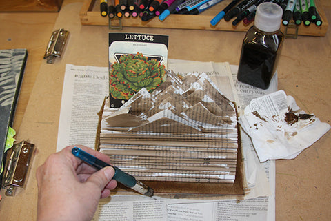
The photo of my desk topper above was made by making triangle folds moving from the right, across the middle, to the left, and back in reverse:..I started with a center triangle by folding the outer corner into the center on both sides of the page. In between each triangular fold, I folded the page in half, towards the center gutter of the spine. The half page folds increase the stability of the overall base.


In the photo above, I am showing a center triangle. In the image below, my fingers are lifting the small right side folded into the center, while the left bulk portion of the page is folded into a left-sided triangle top. In between are the folded in half pages.

For this particular desk topper, I painted Walnut Ink onto the pages in a rather haphazard way…the pages could be sprayed with inks or paints, painted first, or after folding. I have a friend that can’t make anything without glitter glue, so of course, her books are heaped with lines of various colors of glitter. Gesso or other base could be applied to the pages, other pages glued on or stuck in, then sprayed or painted or ? There are a lot of options!
I brushed on Walnut Ink with a basic cheapo brush, going for a mottled look. I actually painted on the ink on the first third and kept on folding, cutting and folding until I reached the peak of the base. Then I folded groups of 6-8 pages in half, then 4 pages, then 10, just random numbers of half folds without triangular tops. These will hold up the triangles, making it easier to put the bits and pieces in between the pages.


In the image above, I have already started to tuck in pieces of painted, stamped, stenciled papers and cards.
Since my studio desk is over one hundred years old, made by Gary’s grandfather, I am super careful of anything touching the wood surface that isn’t absolutely soft. I made a felt base for the desk topper with a piece of cardboard attached with double-stick carpet tape to craft felt, then trimmed to size. I keep all sorts of card around, backs of sketchbooks, watercolor pads, paper tablets, etc. I love the thin card used to pack shirts or sheets. If I am the least bit concerned about archival quality, I will seal the cardboard with a Golden GAC 100, to prevent acid drift.

I attach the base of the paperback book to the cardboard using either double-stick carpet tape or some type of glue.

Once the base is adhered to the cardboard/felt base, I paint on Walnut Ink all around the visible area.
Obviously, there are so many different ways I could choose to decorate the folded pages! Or, just leave the pages alone and just fold. The card for my friend battling illness is a Scrabble book, kind of a joke between us about 7 letter Bingo plays, and I wanted the pages to be visible. In the next lesson I will show you some different types of insertions, including floral wire, seed packets, notes and journal cards, word poems, etc.
Optional Items to Make for Your Paperback Book Base:
Once again, I am so totally in love with Tangie’s Collage Sheet collections for so many reasons, and for this particular project, the printed sheets are an easy and fun way to give a set of variations as a gift with the card base. I tend to print off a batch of collage sheets, my own art journal layouts, photos, or other pages, and keep a stack by the computer or TV or anywhere that time is spent listening to a video or tutorial. I cut out bits and keep them all in a tray for the next project, many times first fusing the printed sheet to another paper or thin index paper or cardstock to stiffen, as this makes fussy cutting so much easier.

I also keep paper edge trimmings, little squares of card, photo trimmings, and other edge bits in a box as possible “attachments” for my collage pieces. Sometimes I glue, sometimes I use double-sided tape, or even permanent soft gel medium, to attach the printed cutout to the floral wire or card. I have a lot of covered floral wire from some mythical project lost in the mists of the past that I love to use for this type of insert as I can bend and bend over and over again without breaking the wire. I often attach little stitch samples leftover from a project, or a City and Guilds sample set, or whatever, and attach it to the floral wire with Golden High Gloss gel medium, Soft or Hard Gel, laid out flat to fully dry over at least 24 hours. The first image below is the front piece of free motion stitching on a piece of blue dupioni silk, glued to a spiraled floral wire. The second image is the dried Hard Gel. Once dry, all the Golden gel mediums can be cut or trimmed with a scissor.


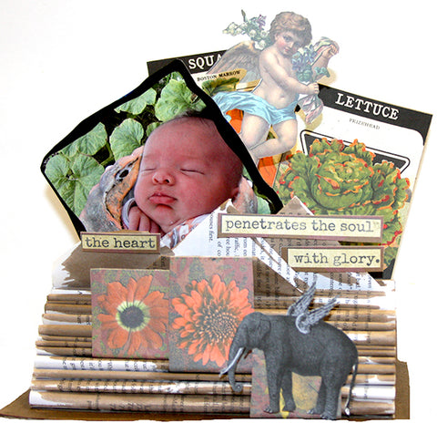
Below is an image from my friend’s card, where I have glued a batch of bits together. The wire or card or other bottom portion is tucked right between the folded book pages, and voila’, instant interactive card.

I have a large and wonderful base that I use to organize which seeds I will plant next in my greenhouse this time of year. I found this paper from a now defunct shop in Colorado of vintage seed packets and decided to fuse each one to cardboard as spacers for my large seed collection. Once late fall arrives, I like to stick one or two into a base book with the seeds so I remember to go toss a few rows into the greenhouse beds for winter eating. In the spring, I would need a table top for all the varieties that I plant! Now, not so much, so the art work is a much appreciated reminder of all the gifts that gardening brings to my soul. The paper had been crushed and rolled badly, so first I pressed the back with a dry iron to take out some of the crinkles, then fused Wonder Under two-sided glue to the back.
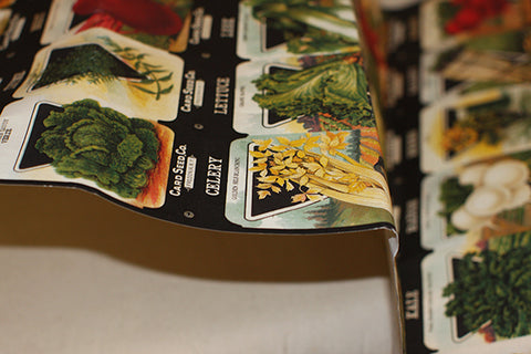

Once the fusible cooled off, I used a rotary cutter to slice through each row, then each individual packet. Some of these I fused to card, others to scrapbook or Kraft paper.

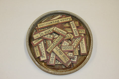
Word Art is another fabulously fun option for an insert. Here is an image of another collage sheet of Tangie’s from the latest collection that I fused to Wonder Under, then after peeling off the backing paper, fused to a piece of thin card. I used the rotary cutter to cut between the lines, then either rotary cutter or scissors to separate the words. I keep a bowl of words on my desk and make little poems, affirmations, card greetings, or whatever with them. Sometimes I just line up words on my desk then sweep all back into the bowl.


So here again is an image of my desktopper:
I wish to you all a very safe and happy Thanksgiving…this holiday is always about gratitude for me. I feel so blessed on every level of my being, and I thank God for a long list every day. This month in my art journal I have been celebrating this incredible community of artists, the Art Journal Caravan, and our very own Tangie Baxter. So for all of you, I hope there are some moments in this holiday season to make art, to express yourself in color and form, even if just for a few moments here and there.
take good care,
Rain
~~~~~
Please join us next Flashback Friday as we continue our journey with Rain.
Have a great weekend!
[Posted by: Joy]
A few years back we had a feature called "Art Travels with Rain". Please note these may be altered from the original posts to update links, provide information on newer programs, etc.
Enjoy!

Hello everyone,
I hope all you are staying warm in the areas of the country that are in the deep freeze! Yikes, Batgirl! Wind chill numbers keep scaring me, although here in western Colorado it has been lovely and sunny even though cold at night. I have seen photos from Ontario where the snow is two and three feet deep…wow!
So for this chilly week I am exploring the blue/orange color complements. I love, love, love, using complementary color pairs to make neutrals like grays and earthy browns in everything from thread, dyed fabrics, colored pencil, and paints of various types. It is so easy to make beautiful, illuminated neutrals rather than the flat color that comes with just adding white, black, or gray.
So what is a complement? Basic definition: colors that are directly opposite on the color wheel.
The 3 major complementary pairs are:
Blue/Orange
Violet/Yellow
Red/Green
Notice that each pair has a Primary color (red, blue, yellow) with a secondary color produced by mixing two of the primaries (green, orange, violet). Now here’s the BIG secret to understanding color mixing across various media:
***Every primary color leans to the warm and the cool, so really there are SIX primaries, for example: yellow that leans towards green, and yellow that leans towards orange. ***
This is the key to totally successful and controlled color mixing!
Let’s look at this on a color wheel that I made with acrylic paints:

Below I have drawn a line between the two blue orange complementary pairs…each paint chip has a specific name below it. These are the specific colors in acrylic paint that act as true complements, and will gray or brown out when mixed together. Have you ever made mud rather than the beautiful color you were expecting? That is because mixing a pigment that is not absolutely true to color will not behave as a complement would.
This is also true with watercolor, poster paints, fabric dyes and paints, colored pencils, inks, basically anything that can be mixed together. It is super important to identify a true primary to make secondaries, and on and on. Otherwise, everything turns to a moody, glunky brownish gooey color.

Now, of course, there is too much of a pure complementary pair if the proportions used in your work is way off…below is another batch of samples I made with acrylic paint, showing the accepted proportions in the art world of the 3 main pairs of complements. In plain English, while you may really enjoy an art journal page with equal amounts of red and green, the same will never look quite right with violet and yellow! I made these samples VERY saturated and bright, not a choice I would make in my work, where I would tend towards a lighter or darker value of one of the colors.

Below is an example of simply adding white or black acrylic paint to Orange, Yellow Orange, Blue, and Blue Violet to make tints and shades. This is one way to lighten and darken your colors, although it does look flat and a bit lifeless.

Here’s another example of various blue colored pencils layered over complementary orange in a cross hatch pattern, then whites, grays for tones, and blacks. With acrylic paint and most markers it is almost instant and mostly opaque, although with pencil and watercolor it will take applying layers to get color mixing that isn’t completely transparent.

Here’s an interesting example of both blue and orange painted papers of different types, and paint chips and magazine cuts. Look at the vibrancy and life of the blue paper chips on the left vs. the right side.

…and here is the orange version:

The next two photos below are from my media sketchbook. I make color logs of every pencil, paint, ink, marker, or other art material I have, mostly to learn the qualities of the material and how it behaves, but also as a future reference. I used drafting tape for the paint samples, and drew pencil lines in a sketchbook as I grouped the pencils, inks, or whatever by color family. I highly recommend taking the time to do this for at least your main paints and pencils…you will so appreciate how quickly fluency with the media will occur, and the reference book will serve your art process for many years to come.


I once did a project during a painting course where I made a geometric abstract schematic, shown below, then cut it up into a numbered pattern to use as a template for cutting painted papers. I learned so much making various color harmonies, including monochromatic and complementary pairs, although the scrappy bits of paper drove me nuts!
So here are two photos of blue/orange:

And below, an experiment in layering the two colors. I was unhappy with how forward the orange became, despite using very little…another great learning of how SMALL an amount of orange or yellow to use if the complementary pairs will not be thoroughly mixed together to form another color. I eventually painted over the pages with a strong ultramarine blue! Much happier.

Various color pencil exercises below, starting and finishing with one or the other colors, density of marks, leaving independent color vs. total mixing:
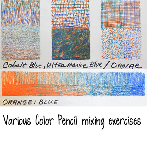
Total color mixing to produce neutrals or interesting new colors is SO much easier with paints and dyes than pencil, I discovered. Below are examples of starting at one color and adding 10% more step.

And trying some other acrylic paint combinations with the same type of exercise, less of a percentage with each step. I love, love, love, the earthy, beautiful red-browns possible from mixing orange and blue!

Are you excited??? In part 2 of the Blue/Orange complementary pair, I will look at some paper and fabric pieces that illustrate this color pair.
I hope you find some time to play with your art materials!
~~~~~
Please join us next Flashback Friday as we continue our journey with Rain.
Happy New Year !!!
[Posted by: Joy]

A few years back we had a feature called "Art Travels with Rain". Please note these may be altered from the original posts to update links, provide information on newer programs, etc.
And don't forget we are featuring Tangible Plans™ Kits all month in TB&CO Treasures! These kits are also great for creating collage sheets like Rain uses in this project.
Enjoy!
Hello!
After a fabulous 12 days with my new grandson, I am home and happily working away in my studio. The weather has shifted towards late fall and early winter and my thoughts are turning towards upcoming holidays. Today I am going to show you a project that is a terrific hostess gift for a holiday party or even just a lift for your own kitchen!
Ok, I have to slip in one photo of the baby boy that has totally stolen my heart and soul:

Ok, Grandma Rain is now willing to move on to art!
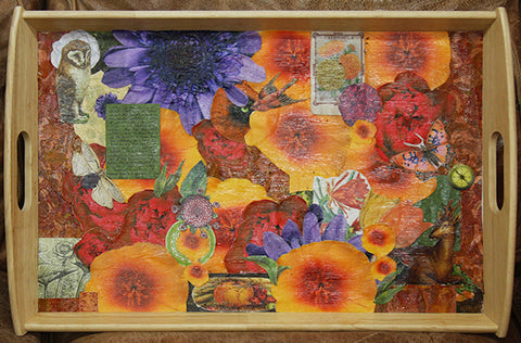
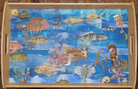
I bought these two wood edged trays at IKEA in the sale bin for under $10, with the thought that a collage in the center would improve the look drastically. Given that the center was a melamine type of surface, I used an appropriate glue and printed out various bits and pieces from Tangie Baxter’s kits, including "Día De Los Muertos {CUATRO}", "Field Notes {Fall}", and the "Collage Sheet Mania 2013". I also gathered up leftovers from my collage bin stash from previous projects.
Here are two images below of the finished trays, with two out of three coats of sealant outdoor Mog Podge®:

Let’s take a closer look at the process of creating this type of collage:

Here is the empty tray in all its non-glory! The wood edges are lovely, a soft finished pine, so I could see the potential. I had a few different ideas so I first gathered up a batch of leftover printed “Tangie-ness” to layout some possibilities.

I decided to go for poppies and fall themed items and tried out a few layouts. The second image is not glued, just laid on top of the tray.


I was happy and decided to start applying glue, and of course changed my mind half a dozen times! I used Nori paste made by Yatsutomo brand as I knew it would stick to the melamine surface of the tray, and is water soluble for easy clean up. Plus it gives a bit of time to reposition!

I started on the left and moved to the right, applying the glue to the back of the collage bit with a glue brush on top of an old catalog. I just turn the page whenever it gets too much wet glue, and eventually toss into recycling.


I then let the finished tray dry completely before adding a sealant to the top for waterproofing. In Colorado this takes about an hour! Most climates that have some humidity and aren’t at 6000 feet in elevation would require at least one day to fully dry and harden before applying the sealant of your choice.
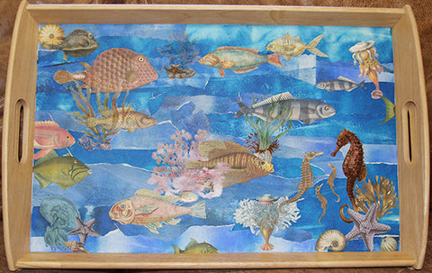
Here’s what I did for the second tray, using collage sheets from Tangie’s “Purple Tide” (Retired, but still available in The Vault), and other ocean related kits, on a background of my own painted paper leftovers from another project. I tore the background papers into strips, and occasionally used the deckle edged ruler to tear against. I then used the same Nori paste to make the background first.

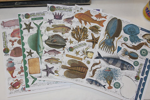


I did some “fussy cutting” around various bits from the collage sheets and added in a few other printouts from a Photoshop file I made from the oceanic kits. I glued each bit down to the background just like the poppy tray, then used a damp paper towel to wipe around the wood.
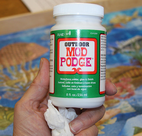
I also let this tray dry for a good couple of hours here in Colorado before applying the Mod Podge® outdoor waterproof sealant.

The sealant is your choice…I went with the Mod Podge® because it is water soluble, doesn’t have an off-gas of fumes like most varnish products, and dries quickly. I also often use Polyvine® Wax Varnish, available at your local hardware or paint store, if I can work outside. Today we had snow for the first time and I was feeling moody about getting chilled, so Mod Podge® it is! The image below the product photo is the second coat of sealant on the poppy tray…even in Colorado I allow each coat of sealant to dry for at least one full day, or two if it is damp and raining outside.
Allowing the sealant to dry in several thin coats is far superior for waterproofing, which I desire for a tray that will be used for tea and serving food.

And here we have two images of the drying trays with multiple coats of sealant:

The poppy tray isn’t even close to dry after two full days!
Here’s an image of another tray I am working on for a gardener friend of my cabbage drawings and some photos:

So until next week, I hope you find some time to play with art materials! It certainly has helped me recover from dental work yesterday.
take good care,
Rain
~~~~~
Please join us next Flashback Friday as we continue our journey with Rain.
Have a great weekend!
[Posted by: Joy]
A few years back we had a feature called "Art Travels with Rain". Please note these may be altered from the original posts to update links, provide information on newer programs, etc.
And don't forget we are featuring Tangible Plans™ Kits all month in TB&CO Treasures!
Enjoy!
Hello fellow artists!
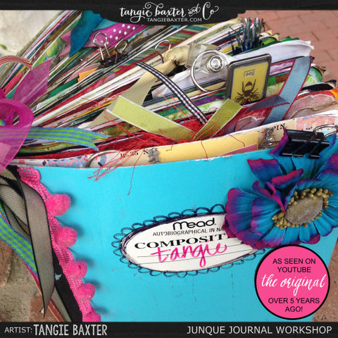
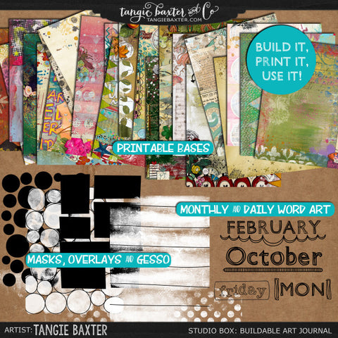
It has been a beautiful day in western Colorado…filled with fall color, misty clouds and first snow on top of the high mountain range I see from my porch. I have had the lovely experience of working on a new Junque Journal today, making pages using Tangie’s, Tangible Plans™ workshop. I love the Studio Box: Buildable, Printable Art Journal and the Tangible Plans™ workshops for transforming simple Composition books into my daily companion.
I make new ones when the last are filled to the brim with bits, pieces, ribbons, journal words, lists, photos, and all the vast amounts of ephemera that pass by my eyes in a week. I use these as a daily planner, a place to store my ideas, quotes, seed packets, doodled drawings, printed art journal pages, little paintings, ads that have colors or compositions I want to remember, on and on. I tuck in pressed flowers and leaves, receipts, bits of life I want to remember in the future, and hold close, as well as lists of information such as the passport stamps of the Art Journal Caravan™ by number. These aren’t scrapbooks with formal layouts and photos, or my art books of art journal pages, though many formal pages are generated from the ideas tucked into the Junque Journal. I don’t know how I lived without one close at hand at all times!
This week I will take a look at the nuts and bolts of printing and making the Journal, next week the making of the paper beads, and then the making of ribbons and cords.
Last week I posted about couching and the making of a Junque Journal cover…this one was a gift for a beloved sister-in-law, filled with printed off Tangible Plans™ pages, with lots of areas for her to write or paste on. This one is all mine.

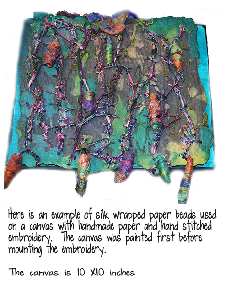
On the binding side are paper and fused silk paper beads made with cut strips from the edges of my Tangible Plans™ print outs. Next week, I will show you how to make these terrific beads that can be used in many ways including jewelry, book bindings, on tassels and cords, and as buttons and closures. (This post was already featured on Flashback Fridays here.)
The cover is a page from Tangie Baxter’s kit, “Field Notes”, printed onto a photo paper and fused to a stabilizer. I made a collage of several flowers from Tangie’s "Día De Los Muertos {CUATRO}", bits of fused silk fibers, and a machine embroidered butterfly. Yes, that is a butterfly, for all of you that took the "The Symbology Project" and attended the chat where I deplored the overuse of butterflies! I actually love the symbol of transformation and the beauty of butterflies.
The cover piece was then free motion embroidered with variegated threads, and a few solid colors, including a zigzag stitch on the edges, then mounted onto the Composition book. I made a simpler backing in the same color scheme and also mounted it to the back.
Then I added the paper beads, the wrapped beads, a few embellishment charms, and hand stitched it all together with yarn and ribbon. Yes! Then on to the inner pages…
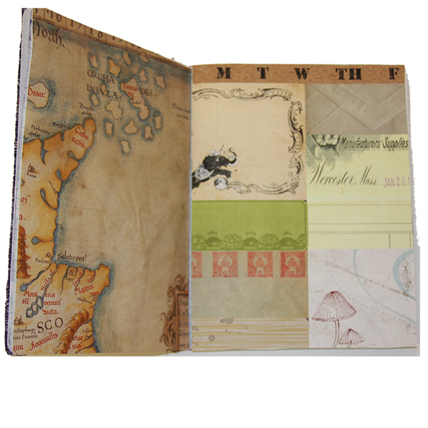
Below is an image of one 2 page spread from my last Junque Journal:
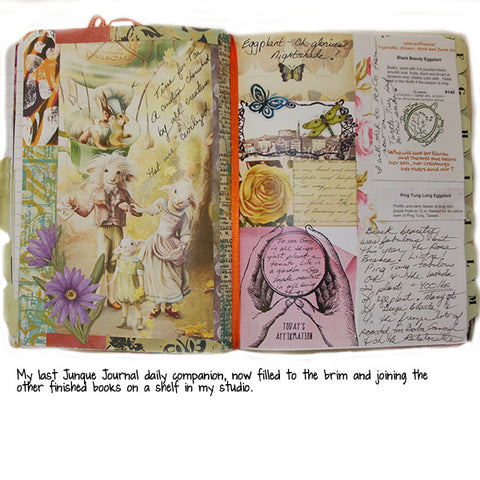
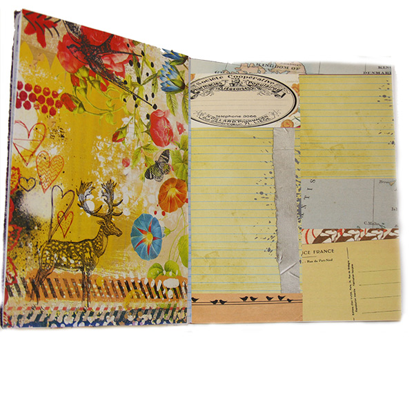
A few more pages that are for the new Junque Journal, in their beginning phases:


Above is a photo with one way to measure and trim the printed page before mounting into the Composition Book, by folding the side and top and then cutting off the excess.
Below is another method that I use the most often…using the Composition Book itself to trace around on the back of the printed page, then cutting it out and mounting.

Here is a view of my work table, and the pile of edges trimmed off the printed pages. I keep these in a basket for adding to the center bit of the Composition Book, or saving for the future.

And as a preview for next week, here’s a look at some paper beads in the making:

So until next week, I hope you can find some time to make art!
take care,
Rain
~~~~~
Rain mentioned some different workshops in this post that are still available as self-study workshops. Please note Tangie's not doing a 2017 Tangible Plans™ class this year, but 2016's is still packed with amazing goodness if you haven't taken it yet.
"Tangible Plans™ 2016 "How To" Workshop & Exclusive 2016 Packages"
"Junque Journal Workshop"
"Studio Box: Buildable, Printable Art Journal"
"The Symbology Project"

Please join us next Flashback Friday as we continue our journey with Rain.
Have a great weekend!
[Posted by: Joy]
A few years back we had a feature called "Art Travels with Rain". Please note these may be altered from the original posts to update links, provide information on newer programs, etc.
Last week Rain introduced us to The Blue-Orange Complementary Colors. This week she continues that theme.
Enjoy!
Today I will continue to explore the blue/orange complementary pair of colors by showing you some of my work…I often gravitate towards complements and triads unconsciously, as I love the “snap, crackle, and pop” of these color harmonies. First off, here is one of my week 1 2014 Art Journal Caravan™ pages that I noticed was in the blue/orange ranges after the fact:

This is a good example of value shifting within a complementary pair…if ALL of the oranges were at full opacity and saturation, it would look totally different and pretty much spoil the mood I wanted in the page, so most of the elements from Tangie’s January AJC14 collection on this page have the opacity down anywhere from 30-50%.
Here’s the second page from the first week, similar color scheme, but with more saturated color left at full opacity:
Doesn’t that feel totally different as far as “mood” goes?
Value shifting in a color family in the main factor that determines the overall mood and tone of a piece rather than the hue family. I have often heard folks comment on yellow being “cheerful”, red as a “power color” , or blue “feeling serene”, yet when examined, it is the strength of the color that provokes certain emotional responses…I have seen pale, high value yellows look moody and sad, and saturated, dark value blues that feel anything but serene. These days many of my color choices come after I determine what mood or emotion I want to convey in the piece, then I choose hue and value, then accents and complements.
Let’s look at a few more examples:
Below is an image of a rubbing I made…the background is sponge-painted acrylic, then Shiva/Markal oil paint stick rubbed onto the paper over a print block. The blue is iridescent. Notice how the lightest blue in the lower spiral becomes the focal point simply for being the lightest value?

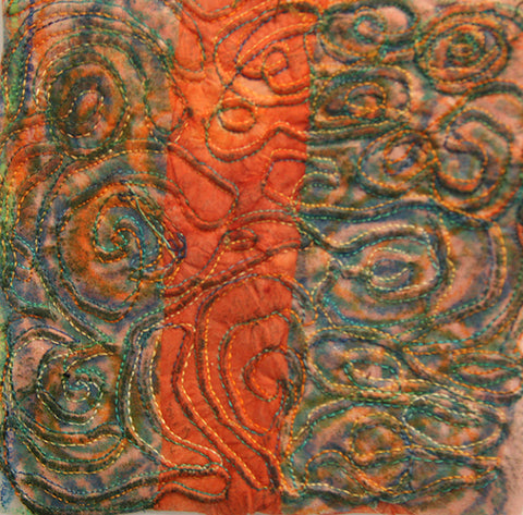
Next is a stitch sample, with orange as the dominant of the complementary pair. The thread was variegated from yellow orange to deep orange, and a blue to blue green. Notice how vibrant and clear the thread colors are against the left hand side vs. the center orange strip…the orange is so strong that it mutes the thread colors. Obviously, there is a time and place for bringing the thread colors forward or back in the piece, and this sample was very helpful to me making choices for the finished wall quilt.
Here is another sample of stitching on printed/painted felt fabric, with a light blue thread. I wanted the wavy stitch pattern to be forward and the lighter value thread accomplishes this easily. Notice how the medium value blue thread recedes into the fabric, and takes a minute of studying the sample to see all the other layers of stitching. I created depth in the piece using the various values of thread rather than layering more fabric or paper, then top stitching. This is easy to mimic with markers, pencils, or other art tools, using the lightest value to create pattern on top of your page, almost like a layer mask in Photoshop.

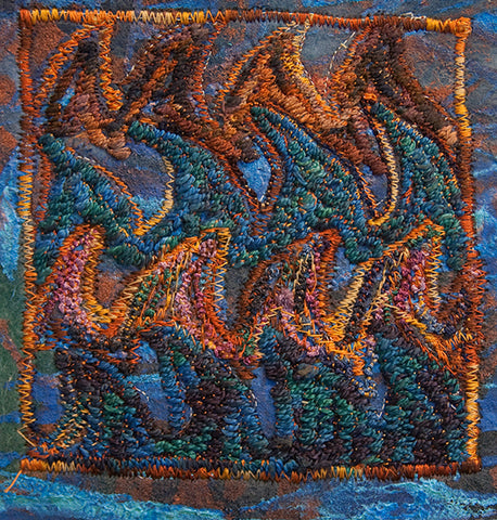
In the next sample, I have heavily satin stitched, and used some free motion zigzag to create the wave points onto the same background printed felt fabric as the sample above. The orange variegated thread colors are visible in the square stitched border on the inner edges, ranging from pale to dark, shaded orange-brown. The blue wave points add tremendous levels of texture and depth because they are a medium value, so not the primary focal point. Again, easy to apply these same ideas to hybrid or digital art pages.
Here are four pages out of my working sketchbook about a piece on rust…color studies with watercolor and inks, some pencil, printing and painting fabric, a few stitch samples, this is generally how I think through a major piece of work before launching. I write notes to myself, ideas of other things to try, then a lot of times go off into entire other pursuits before returning back to working on an idea. Some of these never make it out of the sketchbook phase, others might see the light of day in a completely different form, even years later. I love having a shelf full of working sketchbooks as time passes and I revisit entire emotional experiences through my samples and thoughts.


A few other finished pieces of work that are in this color scheme:
A previous Tangie Baxter blog post on making trays with torn painted paper and Tangie’s collage sheets…note the totally muted orange family in the fish and sea life vs. the vibrancy of the blue background papers.
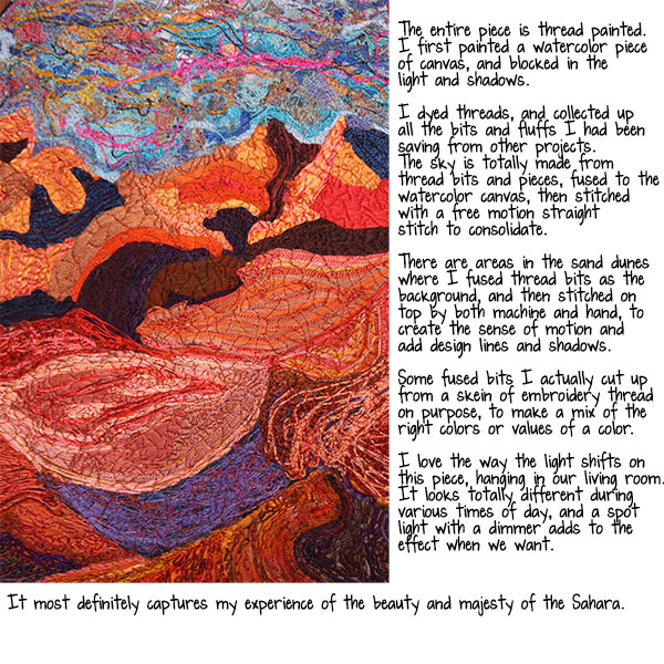
This is a close-up of “Morning in Merzouga” , a densely stitched piece that measures 3 X 2 feet, also featured in a previous blog post with the paintings underneath the stitching. This is a great example of using a color’s complement as an accent to accentuate contrast.

And finally, a close-up of “Elemental Dance”, 4 X 3 feet, stenciled and painted fabrics, thread-painted face and hair, fused silk paper, all dyed and painted by hand. Here is Earth, many values of orange with Water edging in with all of the blues.

Well, that’s it for today!
I hope you can find some time to make art today.
take care,
Rain
~~~~~
Please join us next Flashback Friday as we continue our journey with Rain.
Have a great weekend!
[Posted by: Joy]
A few years back we had a feature called "Art Travels with Rain". Please note these may be altered from the original posts to update links, provide information on newer programs, etc.
Enjoy!
Hello fellow Art Travelers!
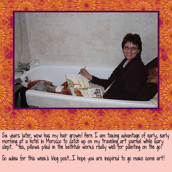
Oh it has been a long time since we last spoke…I have had the sad notebook computer repair tale going on for far too long. The repair quote was two weeks, I gave it 6 before my trip, and now I’m home and it is 13 weeks later without the repair done! Hence, three posts in one today! I hope nothing on the blog melts from all these photos.
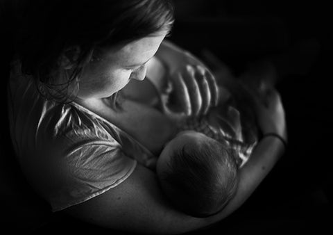
Just in case you are wondering…yes, my beautiful and perfect grandson, Danny the third, is now almost 5 months old. Ok, one photo for the Grandma over here and then onto printing blocks:
This is Jessica and the baby taken on Maui and for all you photographers out there, an exercise in closing down curtains in mid-day, bouncing the light off a reflector (white pillowcase at the condo) into the mirror to get the lovely catchlights in Mom’s eyes.

Ok, one more: This is a black and white conversion I did for a class exercise
And on to the topic at hand: Making Printing Blocks
I love to print with fabric paints, thickened dyes, or acrylics on various papers and fabrics. I also enjoy making rubbings on top of the print blocks, then flooding with ink, watercolor, or pencil for an entirely different look. Tangie has a wonderful batch of print blocks for sale that I adore, and use often. These lessons will give you some ideas on how to design and make your own. In the future, I will give you all some of my favorite block cuttings tips and tricks, and also explore the various art media I like to print with. So for now…on to some design considerations!
I tend to explore themes, using art and design, then on to stitch or some of type of mixed media interpretation. For example, here is a 2 page spread of collaged photographs on star and cross motifs:

I will often make collages of my own or found photographic images when exploring a theme, or trying out a color scheme, then I will doodle, draw, trace, or otherwise check out shapes I am attracted to.
Here’s an example of one of my sketchbooks:

Once I identify a shape, I will trace or photocopy the motif, and add black marker to darken if necessary.

I will also use the enlarge/reduce function on the copier to explore scale:

Now the fun really starts! I sometimes can identify a smaller component of the shape that tickles my design eye right off, other times I will fold and cut or divide and cut and just see what I can get. I will also occasionally use a small open frame to isolate shapes within the “mother” shape.
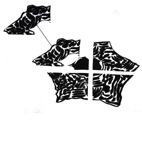
Once I find a shape I like, I will play around with various patterns: linear, half-drop, etc., and make new shapes with the one component, all with photocopies.


 I will also go back to my sketchbook drawings for further pattern ideas:

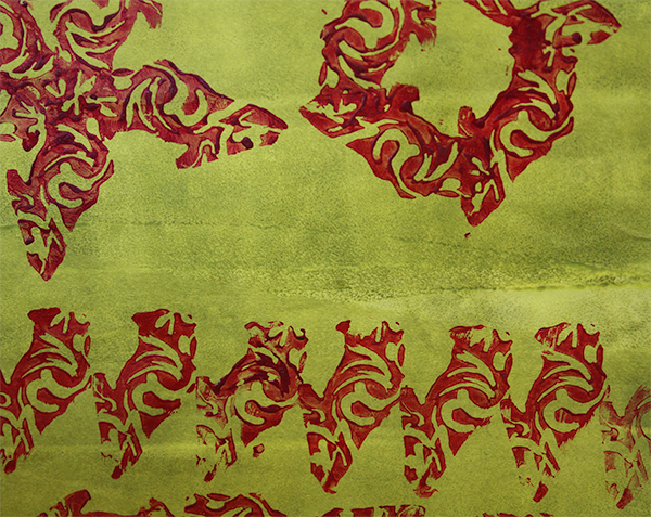
Here are a few pages of acrylic paint and thickened dye prints using the blocks I made from the designs above:


Below is an image of one of my big sketchbooks showing some of the tracing and photocopies attached to the pages with the original inspirational photograph…it might be a long time before I ever make a stencil or print block, but all the design work is done and safe in the sketchbook.

I will often trace in pencil and then start removing lines to simplify the design for a print block:

Some drawings before I cut the block, mostly to know what to remove vs. leave, the positive printing raised surface vs. the negative space.

And here are some images of the above blocks in action.


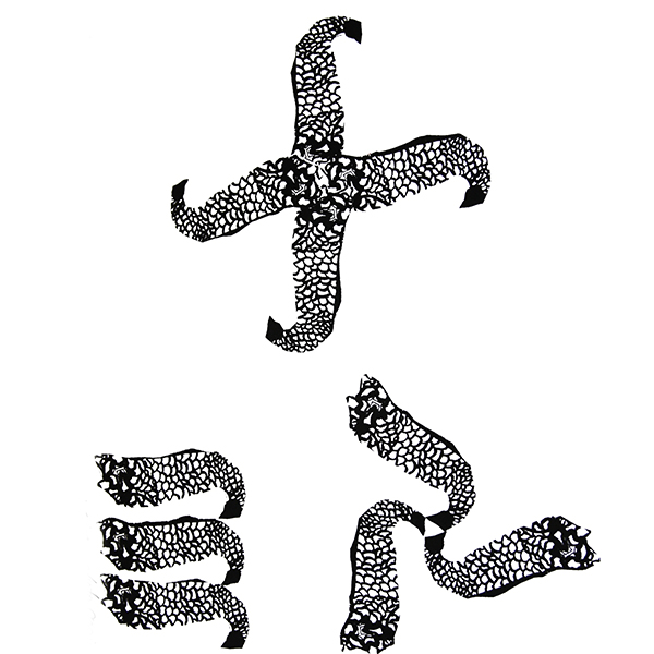
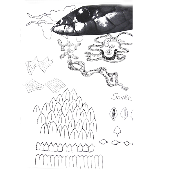
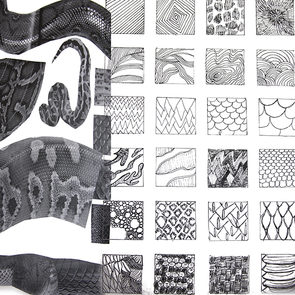
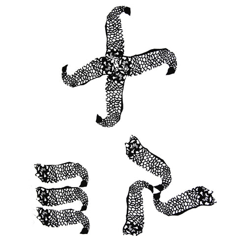
I will often take an animal or reptile or other living creature that is highly patterned or textured and extract line patterns in my sketchbook as a design exercise for stencils and print blocks. Here are some examples of snake skin and peacocks:


Once I cut the block, I will make a black on white paper print for my block inventory…it is easier for me to visualize if I see it printed on paper, rather than in the reverse on the block.

That was a pretty messy example!
Here are a couple of images using the blocks into molding paste, tar gel, or other raised gel medium over a painted and printed surface:


Finally, in my design sketchbook, I do keep a record of bits of printing, along with the fabrics, paints, papers, or whatever I used. Here is an image of one of my City and Guilds documentation spreads with these blocks:

Until next time, I hope you find some time to make some art!
take care,
Rain
~~~~~
Please join us next Flashback Friday as we continue our journey with Rain.
Have a great weekend and Happy New Year!
[Posted by: Joy]
With the holidays almost upon us I thought I'd share Rain's wonderful post about making paper beads. These can be used in all kinds of handmade items/gifts and are so easy to make! Please enjoy this week's Flashback Friday episode. Please note that some references to websites may no longer be valid but could not be edited due to the formatting of the original post.
Enjoy!
Greetings!
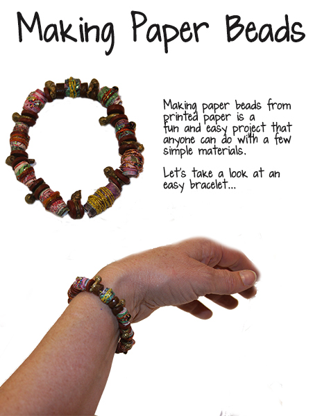
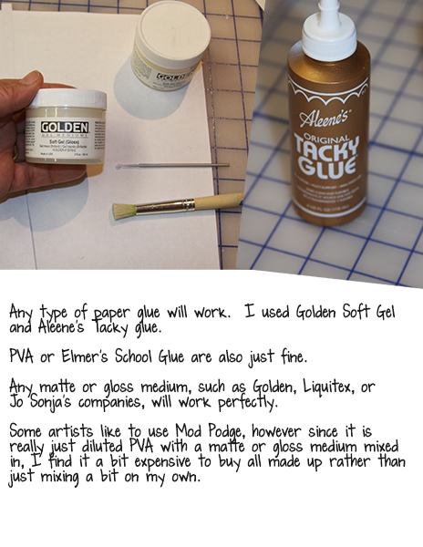
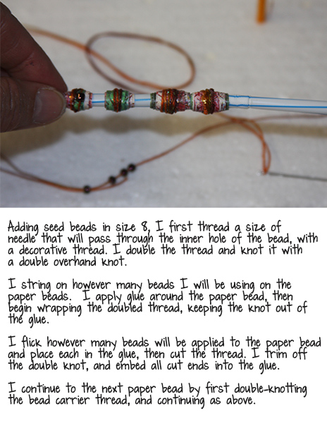
Making Paper Beads
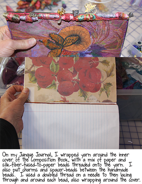
Making paper beads from scraps and trimmed edges is a fabulous way to use every bit of printed page in your stash. I often make a set of paper beads whenever I am working on a new Junque Journal with the trimmed off top and side of the page that doesn’t fit in my Composition book. Last week we took a peek at my latest Junque Journal, with the paper beads on the binding side: 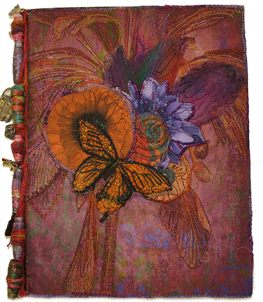
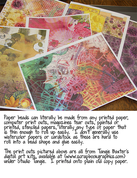
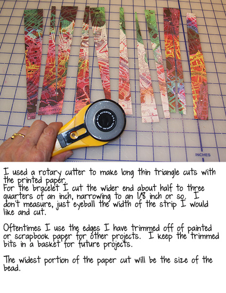
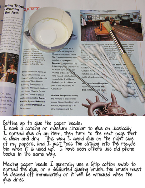
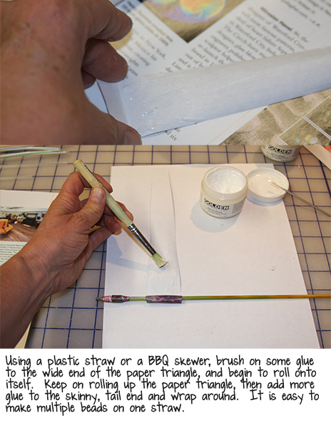
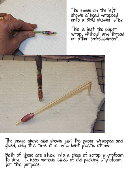
Now let’s take a closer look at how to make the paper beads:
Embellishing Your Paper Beads
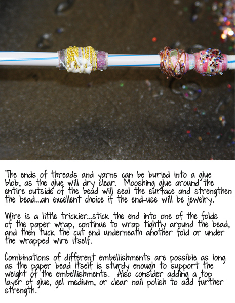
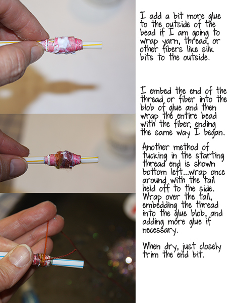
Now that you have some basic wrapped paper beads made, there are all kinds of fun ways to embellish. In this lesson we will look at some embellishment techniques, and a few end-uses of the beads. I set up all the embellishment options right at the start of making the paper beads, so it is literally start to finish in one go. Occasionally I have waited until the beads were dry, and sometimes even weeks or months later, added more embellishment to the tops. The beauty of these beads is that anything goes…the only real “mistake” is to get the bead soaking wet before it has a surface sealant of glue or embellishment, etc., as the paper WILL disintegrate eventually. Having said that, I have rescued paper beads by simply adding another layer of glue to the top!
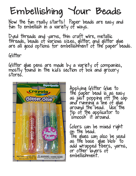
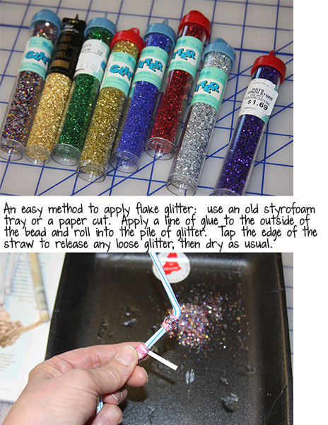
In the photo image above, “paper cut” should be “cup”! I often will cut down an old paper cup to use as a holder for glue or glitter. The cup can be used over and over, just like the styrofoam tray pictured above. These trays are just washed and dried food trays. I also clean up and save those take-out hard plastic containers with a snap down lid…these will work to store a glitter or bead pile in between work sessions. I do put a rubber band around the lid for insurance, as dumping glitter or beads all over is a real pain to clean up!
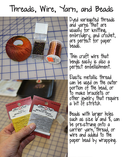
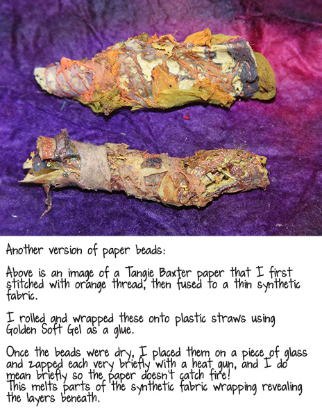
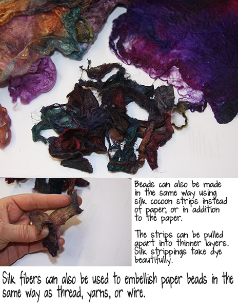
Here are two other ways to add to the paper bead base, or leaving the paper out entirely:
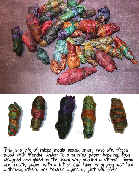
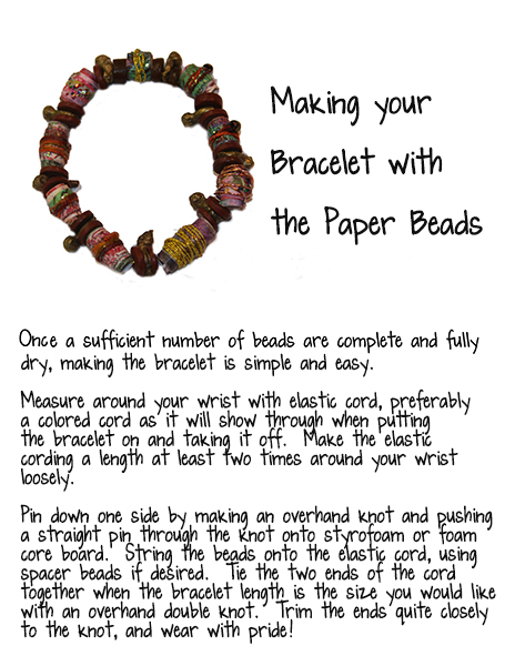
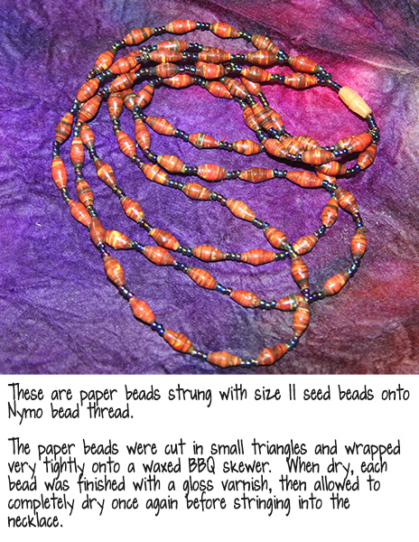
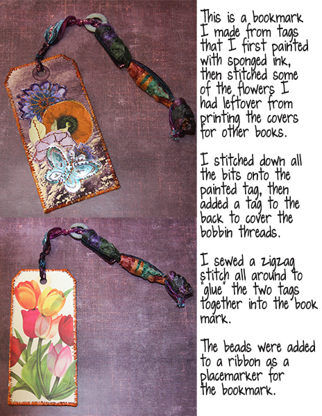
Let’s look at a few ways I have used paper beads:
I hope you find some time to enjoy this beautiful fall weather and make some paper beads!
Take good care and Happy Halloween, Samhain (Wiccan New Year), and El Dia De Los Muertos,
Rain
"Junque Journal Workshop"

Please join us next Flashback Friday as we continue our Art Travels with Rain.
Have a great weekend!
[Posted by: Joy]
A few years back we had a feature called "Art Travels with Rain". Rain did a wonderful series on sewing that we are reposting in our Flashback Fridays segments. Please note these may be altered from the original posts to update links, provide information on newer programs, etc.
In case you missed earlier posts in the series:
Art Journaling Sewing Lessons 101
Lesson One: Making Borders and Pockets Using Automatic Machine Stitching
Lesson 2: Using Fusible Interfacings to Attach and Glue Papers and Fabrics
Lesson 3: Thread Painting and Interlacing, Part 1 of 2
Lesson 4: Thread Painting Part 2 of 2
Lesson 5: Interlacing, Piercing, and Couching Part 1 of 2
Hello,
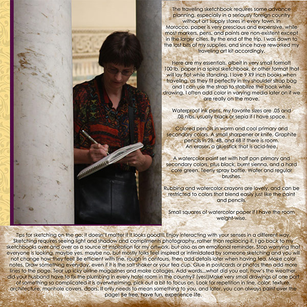
I am writing this blog post from Sedona, AZ., a few days before attending Tangie’s workshop at the new Artspirations Studio…totally exciting!
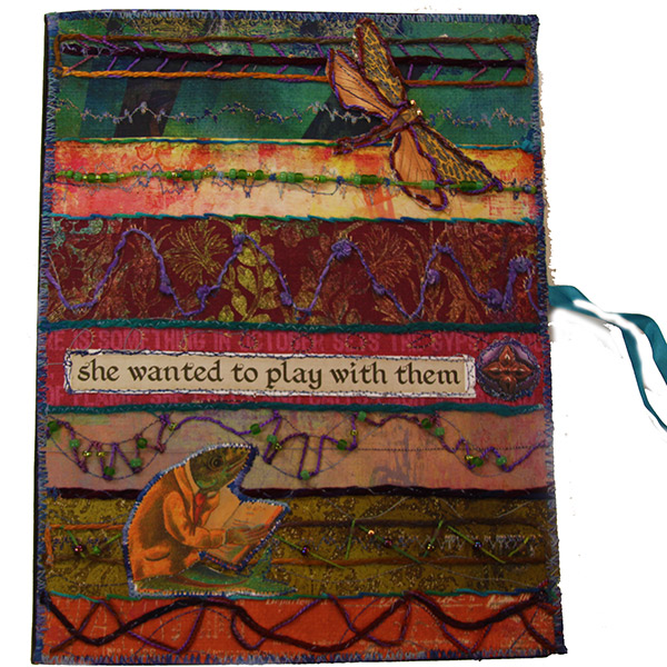
This week we will take a closer look at the making of the Junque Journal cover, pictured below, with a focus on couching:

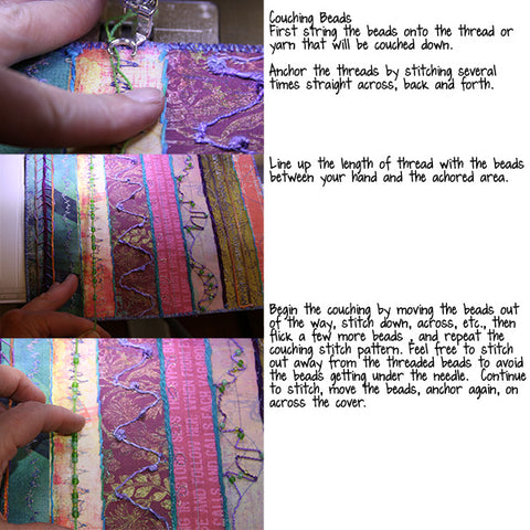
Couching is basically where threads are laid onto the surface of paper or fabric and stitched down with another thread. The couching technique is often utilized for larger threads and yarns that do not pass through the eye of a needle or paper easily. I couched several heavier yarns and embroidery threads onto the printed Gypsy Diaries page for the Journal cover by machine, then used the threads for lacing with other threads and beads.
The paper or fabric needs to be heavy enough to support the attached layer of heavier threads on top, or be stabilized with other paper, fabric, or interfacing.
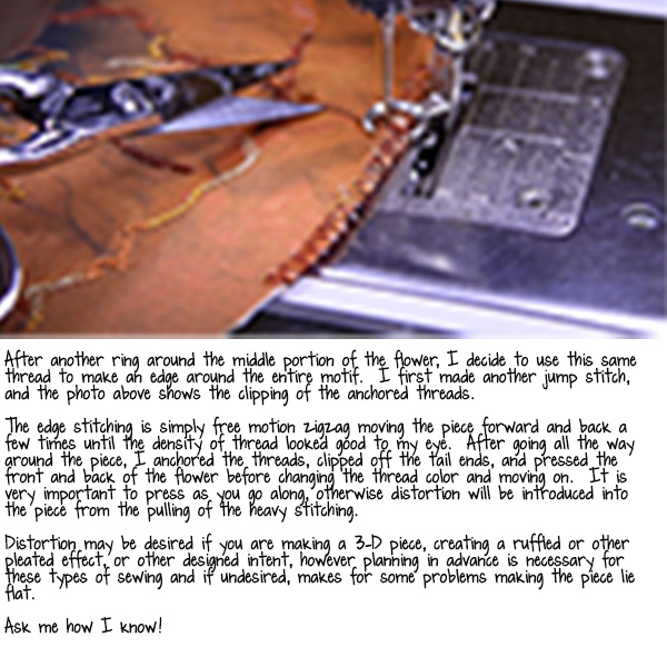
If I am couching to form an edge treatment, I will use a wider zigzag stitch so that the couching yarn is totally encapsulated with the edge of the piece. Literally any machine stitch may be used to couch threads by sewing machine, including straight, zigzag, satin, in either free motion or automatic mode, as well as automatic decorative stitches.
Couching works for an amazing array of embellishments from wire and pipe cleaners to feathers, knitted I-cord, and paper beads, in addition to any size of threads and yarns.
Couching using hand embroidery stitches has all the same variations and considerations, and will often require piercing holes into the base paper or fabric first for a hand needle to pass through the fabric or paper.
Some options for hand couching:
*One thread in the needle straight stitching over a single or double strand of yarn or thread.
*Couching any number of strands with a cross stitch, open chain stitch, blanket stitch, or herringbone.
Below is an image of some automatic stitch notes from one of my sketchbooks:

Below is another example of couched felt strips and yarns using various machine stitches:

And the next image below features couching with various bits of painted paper, using the machine stitches to make links between the pieces, front on top and back below:

Let’s look at the making of the Junque Journal cover:

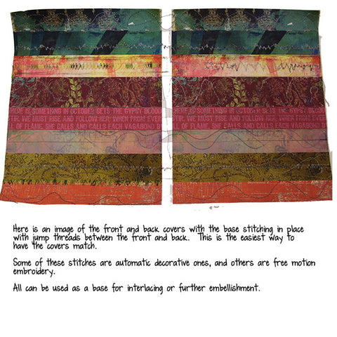
By machine, for a book or journal cover I line up the front and back cover and stitch at the same time. In the image below I am laying down thread to lace, or use as the base of couching or interlacing. I have both the front and back cover lined up, and make a jump stitch between by anchoring the thread at the end of one and the beginning of the other cover, pulling the thread between.

Below: Here are the covers with the base stitching complete:
So far I have added both free motion and automatic decorative stitches to the stabilized covers. Below is an image of threads and yarns also couched by machine added to the covers. Now I will use the base stitches to add further couching and beads as embellishments.


In the image below I am using hand-dyed embroidery threads to lace and stitch onto the machine base stitches. I have also threaded beads onto some of the threads and interlaced between the rows of couched and machine stitches.

Below is another image of a Junque Journal cover that I am just beginning to pierce and stitch. I will also be adding beads and couched yarns to this cover. This is again a page I printed from Tangie’s Gypsy Diaries Workshop. So until next week, I hope you find some time to make art!
take care,
Rain

This concludes the Art Journaling Sewing Lessons series. Please join us next Flashback Friday as we will begin a new journey with Rain.
Have a great weekend!
[Posted by: Joy]
A few years back we had a feature called "Art Travels with Rain". Rain did a wonderful series on sewing that we are reposting in our Flashback Fridays segments. Please note these may be altered from the original posts to update links, provide information on newer programs, etc.
In case you missed earlier posts in the series:
Art Journaling Sewing Lessons 101
Lesson One: Making Borders and Pockets Using Automatic Machine Stitching
Lesson 2: Using Fusible Interfacings to Attach and Glue Papers and Fabrics
Lesson 3: Thread Painting and Interlacing, Part 1 of 2
Lesson 4: Thread Painting Part 2 of 2
Hello all!
This week we will take a closer look at interlacing and piercing with paper, and begin to look at couching. These are wonderful skills to have in your toolbox for art journal pages, scrapbook or sketchbooks, or other art projects.
Interlacing and Piercing
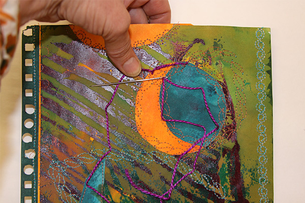
Many thicker and heavier threads, yarns, and ribbons are too big to pass through a sewing machine needle, a smaller hand needle, and really shouldn’t be pulled through paper over and over since eventually both the fiber and the paper will fall apart. This is where piercing a channel through the paper first makes a huge difference, particularly if the hole is stabilized with a brad, an eyelet, or stitching. Piercing a hole before hand stitching on paper also makes it far easier on your wrists and fingers to form the stitch since paper will not fold and bend as easily as a fabric.
Below are a few pages from my hand stitching sketchbook:
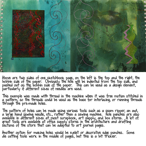
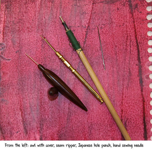

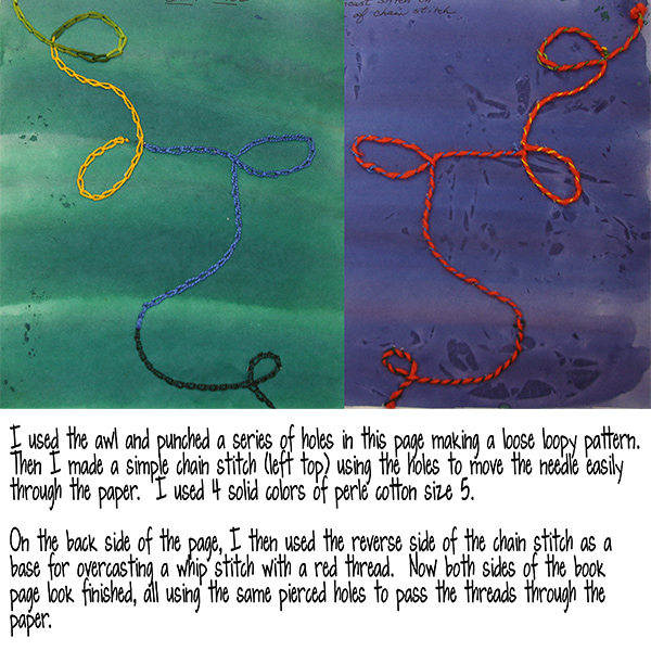
Below is another image of holes that were punched with the larger Japanese hole punch into painted sketchbook paper, and the beginnings of chain stitch.
The next two images are the front and back side of one page out of my hand stitching book, with pen, ink, paint and marker drawings. The edges of the page were pierced with a seam ripper first, then overhand stitched first with yellow, then back the opposite way with green. In the lower right corner you can see the back side of the chain and feather stitching.

And another edge with pierced holes:
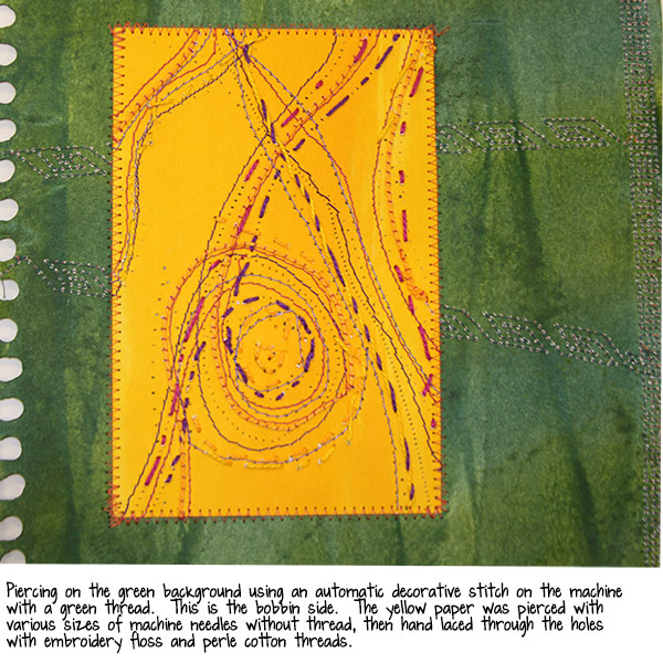
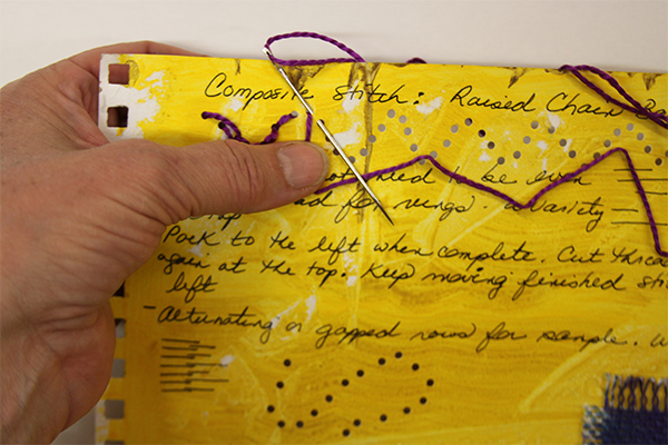
Below is another page from the same book, this one a stitched collage of my painted and monoprinted paper. I am using the machine stitches of the collaged bits to anchor hand stitches with a thicker thread. Since the automatic decorative stitches have a lot of thread bars, I can pick and choose where to insert the needle for my design.
It isn’t necessary to have a sewing machine to make the thread bars, you can also just lace thread through pre-punched holes, then use those thread bars as an anchor for further embellishment.
Let’s look at a “Junque Journal” cover I made from a printed page from Tangie’s “Gypsy Diaries” workshop. Below is the finished and mounted cover:
In part 2 of Interlacing, Piercing, and Couching, we will take a close look at making this journal cover which includes all of these techniques.
~~~~~
Please join us next Flashback Friday for another Art Journaling Sewing Lessons installment.
Have a great weekend!
[Posted by: Joy]
A few years back we had a feature called "Art Travels with Rain". Rain did a wonderful series on sewing that we are reposting in our Flashback Fridays segments. Please note these may be altered from the original posts to update links, provide information on newer programs, etc.
In case you missed earlier posts in the series:
Art Journaling Sewing Lessons 101
Lesson One: Making Borders and Pockets Using Automatic Machine Stitching
Lesson 2: Using Fusible Interfacings to Attach and Glue Papers and Fabrics
Lesson 3: Thread Painting and Interlacing, Part 1 of 2
Enjoy!
Hello all,
Well here we are a week later and the flood waters have receded, thank God. Meanwhile, our daughter is in labor with our first grandchild! Never a dull moment around here!
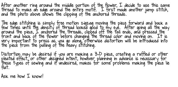
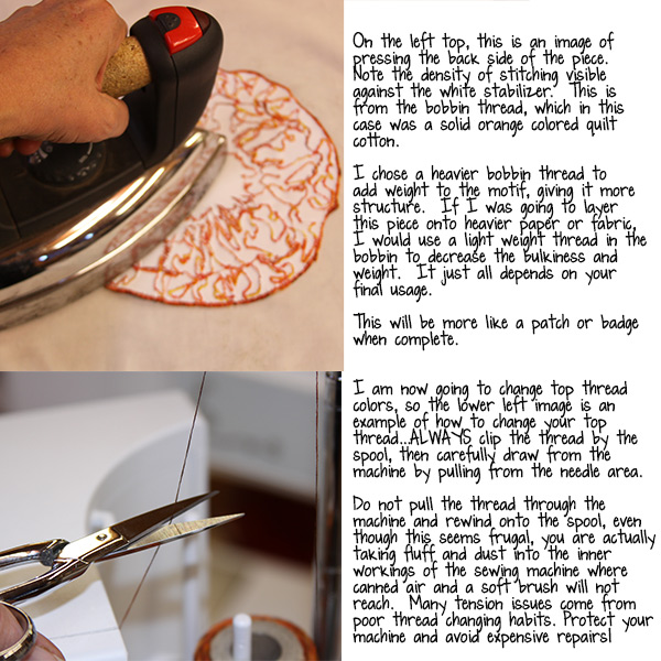
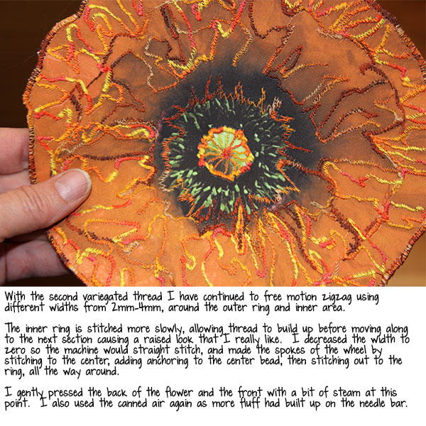
On to the second part of Thread painting, and a closer look at the mechanics of stitching densely.
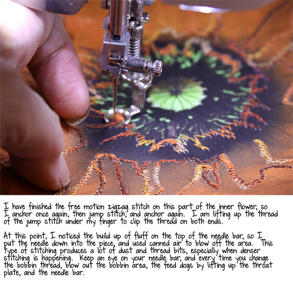
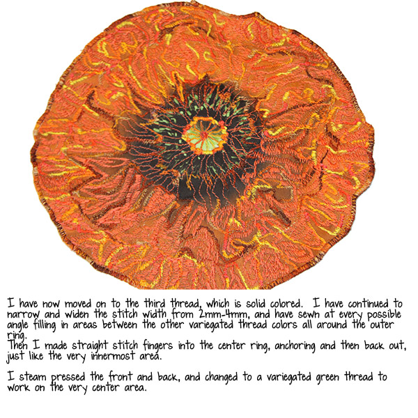
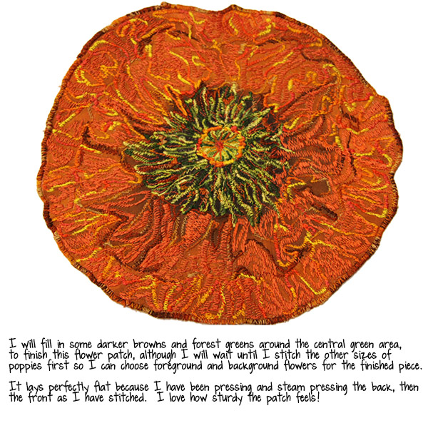
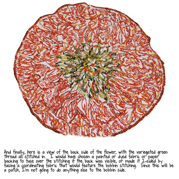
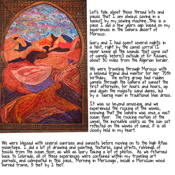
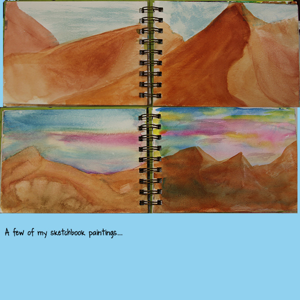
Below is an image from a library slideshow as well as a photobook I made about our trip to Morocco, with tips on the traveling sketchbook:
Please join us next Flashback Friday for another Art Journaling Sewing Lessons installment.
Have a great weekend!
[Posted by: Joy]