Flashback Fridays - Art Travels with Rain: Part 1 of 2: The Blue Orange Complementary Colors January 23 2017, 0 Comments

A few years back we had a feature called "Art Travels with Rain". Please note these may be altered from the original posts to update links, provide information on newer programs, etc.
Enjoy!

Hello everyone,
I hope all you are staying warm in the areas of the country that are in the deep freeze! Yikes, Batgirl! Wind chill numbers keep scaring me, although here in western Colorado it has been lovely and sunny even though cold at night. I have seen photos from Ontario where the snow is two and three feet deep…wow!
So for this chilly week I am exploring the blue/orange color complements. I love, love, love, using complementary color pairs to make neutrals like grays and earthy browns in everything from thread, dyed fabrics, colored pencil, and paints of various types. It is so easy to make beautiful, illuminated neutrals rather than the flat color that comes with just adding white, black, or gray.
So what is a complement? Basic definition: colors that are directly opposite on the color wheel.
The 3 major complementary pairs are:
Blue/Orange
Violet/Yellow
Red/Green
Notice that each pair has a Primary color (red, blue, yellow) with a secondary color produced by mixing two of the primaries (green, orange, violet). Now here’s the BIG secret to understanding color mixing across various media:
***Every primary color leans to the warm and the cool, so really there are SIX primaries, for example: yellow that leans towards green, and yellow that leans towards orange. ***
This is the key to totally successful and controlled color mixing!
Let’s look at this on a color wheel that I made with acrylic paints:

Below I have drawn a line between the two blue orange complementary pairs…each paint chip has a specific name below it. These are the specific colors in acrylic paint that act as true complements, and will gray or brown out when mixed together. Have you ever made mud rather than the beautiful color you were expecting? That is because mixing a pigment that is not absolutely true to color will not behave as a complement would.
This is also true with watercolor, poster paints, fabric dyes and paints, colored pencils, inks, basically anything that can be mixed together. It is super important to identify a true primary to make secondaries, and on and on. Otherwise, everything turns to a moody, glunky brownish gooey color.

Now, of course, there is too much of a pure complementary pair if the proportions used in your work is way off…below is another batch of samples I made with acrylic paint, showing the accepted proportions in the art world of the 3 main pairs of complements. In plain English, while you may really enjoy an art journal page with equal amounts of red and green, the same will never look quite right with violet and yellow! I made these samples VERY saturated and bright, not a choice I would make in my work, where I would tend towards a lighter or darker value of one of the colors.

Below is an example of simply adding white or black acrylic paint to Orange, Yellow Orange, Blue, and Blue Violet to make tints and shades. This is one way to lighten and darken your colors, although it does look flat and a bit lifeless.

Here’s another example of various blue colored pencils layered over complementary orange in a cross hatch pattern, then whites, grays for tones, and blacks. With acrylic paint and most markers it is almost instant and mostly opaque, although with pencil and watercolor it will take applying layers to get color mixing that isn’t completely transparent.

Here’s an interesting example of both blue and orange painted papers of different types, and paint chips and magazine cuts. Look at the vibrancy and life of the blue paper chips on the left vs. the right side.

…and here is the orange version:

The next two photos below are from my media sketchbook. I make color logs of every pencil, paint, ink, marker, or other art material I have, mostly to learn the qualities of the material and how it behaves, but also as a future reference. I used drafting tape for the paint samples, and drew pencil lines in a sketchbook as I grouped the pencils, inks, or whatever by color family. I highly recommend taking the time to do this for at least your main paints and pencils…you will so appreciate how quickly fluency with the media will occur, and the reference book will serve your art process for many years to come.


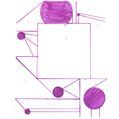
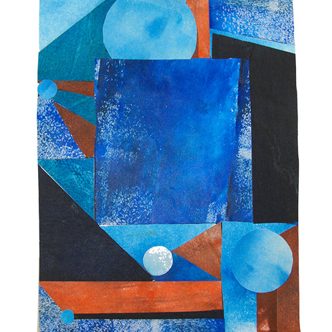
I once did a project during a painting course where I made a geometric abstract schematic, shown below, then cut it up into a numbered pattern to use as a template for cutting painted papers. I learned so much making various color harmonies, including monochromatic and complementary pairs, although the scrappy bits of paper drove me nuts!
So here are two photos of blue/orange:

And below, an experiment in layering the two colors. I was unhappy with how forward the orange became, despite using very little…another great learning of how SMALL an amount of orange or yellow to use if the complementary pairs will not be thoroughly mixed together to form another color. I eventually painted over the pages with a strong ultramarine blue! Much happier.

Various color pencil exercises below, starting and finishing with one or the other colors, density of marks, leaving independent color vs. total mixing:
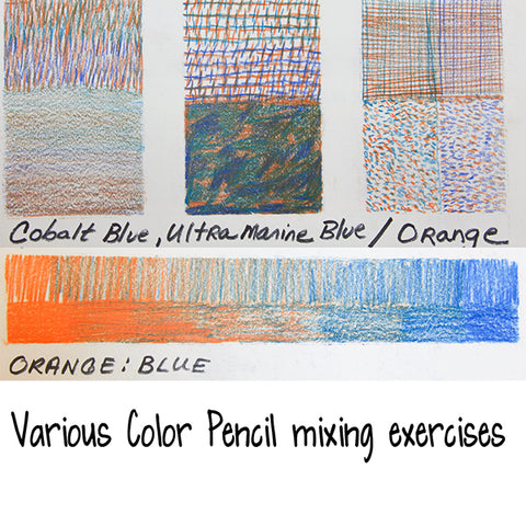
Total color mixing to produce neutrals or interesting new colors is SO much easier with paints and dyes than pencil, I discovered. Below are examples of starting at one color and adding 10% more step.

And trying some other acrylic paint combinations with the same type of exercise, less of a percentage with each step. I love, love, love, the earthy, beautiful red-browns possible from mixing orange and blue!

Are you excited??? In part 2 of the Blue/Orange complementary pair, I will look at some paper and fabric pieces that illustrate this color pair.
I hope you find some time to play with your art materials!
~~~~~
Please join us next Flashback Friday as we continue our journey with Rain.
Happy New Year !!!
[Posted by: Joy]