Flashback Fridays -Art Travels with Rain: Color Hopping: Blue and Orange Part 2 of 2 January 06 2017, 0 Comments

A few years back we had a feature called "Art Travels with Rain". Please note these may be altered from the original posts to update links, provide information on newer programs, etc.
Last week Rain introduced us to The Blue-Orange Complementary Colors. This week she continues that theme.
Enjoy!

Today I will continue to explore the blue/orange complementary pair of colors by showing you some of my work…I often gravitate towards complements and triads unconsciously, as I love the “snap, crackle, and pop” of these color harmonies. First off, here is one of my week 1 2014 Art Journal Caravan™ pages that I noticed was in the blue/orange ranges after the fact:

This is a good example of value shifting within a complementary pair…if ALL of the oranges were at full opacity and saturation, it would look totally different and pretty much spoil the mood I wanted in the page, so most of the elements from Tangie’s January AJC14 collection on this page have the opacity down anywhere from 30-50%.
Here’s the second page from the first week, similar color scheme, but with more saturated color left at full opacity:
Doesn’t that feel totally different as far as “mood” goes?
Value shifting in a color family in the main factor that determines the overall mood and tone of a piece rather than the hue family. I have often heard folks comment on yellow being “cheerful”, red as a “power color” , or blue “feeling serene”, yet when examined, it is the strength of the color that provokes certain emotional responses…I have seen pale, high value yellows look moody and sad, and saturated, dark value blues that feel anything but serene. These days many of my color choices come after I determine what mood or emotion I want to convey in the piece, then I choose hue and value, then accents and complements.
Let’s look at a few more examples:
Below is an image of a rubbing I made…the background is sponge-painted acrylic, then Shiva/Markal oil paint stick rubbed onto the paper over a print block. The blue is iridescent. Notice how the lightest blue in the lower spiral becomes the focal point simply for being the lightest value?

Next is a stitch sample, with orange as the dominant of the complementary pair. The thread was variegated from yellow orange to deep orange, and a blue to blue green. Notice how vibrant and clear the thread colors are against the left hand side vs. the center orange strip…the orange is so strong that it mutes the thread colors. Obviously, there is a time and place for bringing the thread colors forward or back in the piece, and this sample was very helpful to me making choices for the finished wall quilt.
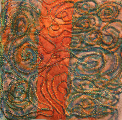
Here is another sample of stitching on printed/painted felt fabric, with a light blue thread. I wanted the wavy stitch pattern to be forward and the lighter value thread accomplishes this easily. Notice how the medium value blue thread recedes into the fabric, and takes a minute of studying the sample to see all the other layers of stitching. I created depth in the piece using the various values of thread rather than layering more fabric or paper, then top stitching. This is easy to mimic with markers, pencils, or other art tools, using the lightest value to create pattern on top of your page, almost like a layer mask in Photoshop.

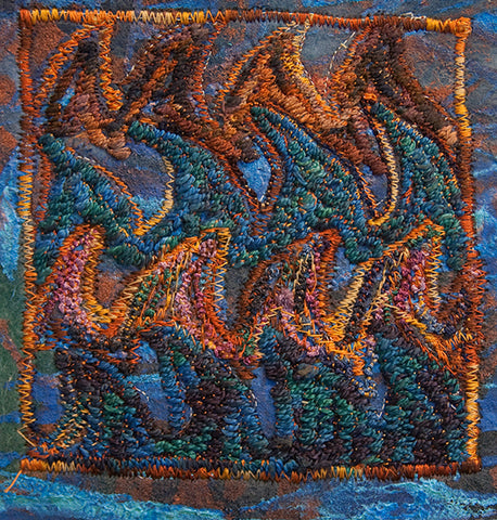
In the next sample, I have heavily satin stitched, and used some free motion zigzag to create the wave points onto the same background printed felt fabric as the sample above. The orange variegated thread colors are visible in the square stitched border on the inner edges, ranging from pale to dark, shaded orange-brown. The blue wave points add tremendous levels of texture and depth because they are a medium value, so not the primary focal point. Again, easy to apply these same ideas to hybrid or digital art pages.
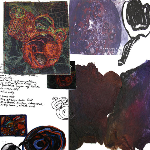
Here are four pages out of my working sketchbook about a piece on rust…color studies with watercolor and inks, some pencil, printing and painting fabric, a few stitch samples, this is generally how I think through a major piece of work before launching. I write notes to myself, ideas of other things to try, then a lot of times go off into entire other pursuits before returning back to working on an idea. Some of these never make it out of the sketchbook phase, others might see the light of day in a completely different form, even years later. I love having a shelf full of working sketchbooks as time passes and I revisit entire emotional experiences through my samples and thoughts.


A few other finished pieces of work that are in this color scheme:
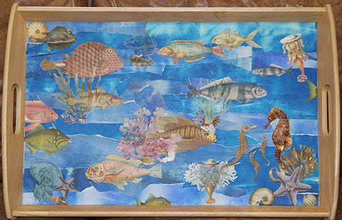
A previous Tangie Baxter blog post on making trays with torn painted paper and Tangie’s collage sheets…note the totally muted orange family in the fish and sea life vs. the vibrancy of the blue background papers.
This is a close-up of “Morning in Merzouga” , a densely stitched piece that measures 3 X 2 feet, also featured in a previous blog post with the paintings underneath the stitching. This is a great example of using a color’s complement as an accent to accentuate contrast.

And finally, a close-up of “Elemental Dance”, 4 X 3 feet, stenciled and painted fabrics, thread-painted face and hair, fused silk paper, all dyed and painted by hand. Here is Earth, many values of orange with Water edging in with all of the blues.

Well, that’s it for today!
I hope you can find some time to make art today.
take care,
Rain
~~~~~
Please join us next Flashback Friday as we continue our journey with Rain.
Have a great weekend!
[Posted by: Joy]