Over the years we've been fortunate to have Julie Ann Shahin share some wonderful art journaling series with the TB&CO readers. We will be re-posting some of them here on this blog. Please note these may be altered from the original posts to update links, provide information on newer programs, etc.
Enjoy!
I once knew someone who told me she spent 15 minutes per page when scrapbooking. She was an amazing paper scrapbooker, and this concept blew my mind as it took me 15 minutes just to decide what color scheme to use! I began to scrap a little faster when I went digital, and then I started taking more time again as I added layer upon layer to my pages, even in digital. Even longer if something needed extraction or modification.
Still, this 15 minute concept has never escaped me. Everyone has 15 minutes they can set aside for art. Even if you don’t finish, that’s ok. You can come back to it another day. Just set aside 15 minutes a day for art. Today we are sharing pages we made in just 15 minutes! My first attempt I failed miserably. I didn’t set a timer, and even though I watched the clock, I gave myself more and more time. I wasn’t satisfied with the page, so I kept going and going and going. I think I took about 40 minutes.
This morning I tried a second attempt to make a 15 Minute Page. This time I did use a timer. I only went about a minute over, as I was finishing making a piece of word art before I could add it. At first, as I looked at my finished page – I thought, “this is too plain for me.” Then I realized it fit my quote exactly. Kismet! (And I explain what made the difference in time below.) What about you? How about taking a few moments to center yourself, take a few deep breaths, count your blessings, and then take 15 minutes for art? Here’s an online timer you can set:
Shelli: I was hoping to get picutres of the Bald Eagles when I went to the local wildlife refuge a couple weeks ago, and though I heard them while I was there, I was never able to see them. I was lucky enough to walk up on a couple of Great Blue Heron’s though, and they were practically modeling for me. The first one was shy & hid behind a bush at first, then displayed his fishing skills for me. The second one struck a variety of poses while wading, then flew up onto a branch in front of pine tree which greated a fantastic background for him. If only nature were always so cooperative with us. A Quickity Split page & a couple of frames later & their photos are ready for display.
Julie Ann
2011 Art Journal Caravan Itinerary 46 – Protect. I used Tangie’s Quickety Split N’ Print background which cut down the time significantly. What takes me the longest everytime is the lettering and choosing of a font(s). Then I took two word strips from the Prose Collection, to make the word “protect” – I took a “c” from one, and added it to the word “protest”. That took me just about a minute over the 15 minute timer. Close enough! Credits: Tangie Baxter's Quickety Split N’ Print from June Grab Bag (Vol 7), Prose Collection and Art Journaling Font Frog Footman.
Over the years we've been fortunate to have Julie Ann Shahin share some wonderful art journaling series with the TB&CO readers. We will be re-posting some of them here on this blog. Please note these may be altered from the original posts to update links, provide information on newer programs, etc. The following is the conclusion of a fabulous post on typography. If you missed the earlier posts in the series you can read them here: Part One, Part Two. Enjoy!
I believe many of us in this industry collect fonts as a passion. Tangie has picked up on this passion when she started her Foundry with her own fonts for sale. Not only that, she has given exclusive video tutorials on how to make the most of these fonts in art journaling to the Art Journal Caravan™ Workshop 2011 (now available as a self-study workshop) to watch at your own pace. Today let’s look at some of the talented Art Journal Caravan members and Studio Tangie Creative Team members, and how they’ve made the most of typography and font use. We’ll see the use of rhythm, energy, repetition and scale. We’ll see the use of contrasting fonts, casual fonts and fonts used for readability. We’ll see text paths, text circles and fonts that guide your eye through the design. We’ll see fonts that offer mood, hierarchy and emphasis. We’ll see fonts with a crackled effect, decorative fonts and handwritten fonts. Also we’ll see typography and fonts that break all the rules! Here we go….
This page by sparklyduck75 is a great example of several types of typography, in my opinion: {decorative font, scale, and rhythm.}
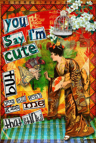
I love this page by wanderer for her use of {warped text}, {text circles} and {sunburst text placement}.
Credits: image designed by me on Marvel.com, recolored in PhotoshopGlitter: Trixie ScrapsBackground: Tommys Garage by Studio Gypsy; Fonts: Pea Tonya, Pea Danley,Pea NJH Script, Pea Chit’s Bits, Pea Bhea Script, & Pea Teran from Fonts for Peas.
This last page by SpunMonkey uses a journaling font for {readability}.
Credits: Tangie Baxter's Seaside Art Dolls, Bee True, Various Collage Fodder Sheets, Painted Grunge Papers, Curious Adventures; Clementine Design's Eleanor’s Avenue; Crowabout StudioB's Funky Birds and Borders, More Wild Things, Borders and Bits, Odds and Ends, Dirty Alpha; Sherrie JD's Body Farm; Teesha’s Land of Odd Teesha Moore's Collage Sheets.
This is a very interesting infographic by Noodlor, and blogged about in detail by Cliff Kuang here. I thought if you are interested in learning more about typography, this would be a great place to start!
I hope you enjoyed this re-post of Julie Ann Shahin's series on Typography. See you next Flashback Friday!
Over the years we've been fortunate to have Julie Ann Shahin share some wonderful art journaling series with the TB&CO readers. We will be re-posting some of them here on this blog. Please note these may be altered from the original posts to update links, provide information on newer programs, etc.
The following is Part Two of a fabulous post on typography. If you missed Part One you can read it here. Enjoy!
I believe many of us in this industry collect fonts as a passion. Tangie has picked up on this passion when she started her Foundry with her own fonts for sale. Not only that, she has given exclusive video tutorials on how to make the most of these fonts in art journaling to the Art Journal Caravan™ Workshop 2011 (now available as a self-study workshop) to watch at your own pace.
Today let’s look at some of the talented Art Journal Caravan members and Studio Tangie Creative Team members, and how they’ve made the most of typography and font use. We’ll see the use of rhythm, energy, repetition and scale. We’ll see the use of contrasting fonts, casual fonts and fonts used for readability. We’ll see text paths, text circles and fonts that guide your eye through the design. We’ll see fonts that offer mood, hierarchy and emphasis. We’ll see fonts with a crackled effect, decorative fonts and handwritten fonts. Also we’ll see typography and fonts that break all the rules! Here we go….
The typography on this page by SpunMonkey creates {energy}.
Credits: Tangie Baxter's A Door Just Opened, Fonts- Mock Turtle, Walrus (included in the Fontastic Grab Bag) and Paperworn Art Styles & Bonus Action
This page by joamosatcharterdotnet demonstrates several typography details. One is {scale} as the fonts go from larger to smaller to create heirarchy.
Credits: Tangie Baxter's AlteredArt Sheet65, She Journals Kit, Fonts- Mock Turtle, TweedleDee and Dinah (included in the Fontastic Grab Bag); TumblefishStudios-East is West Extras and Juno-Note Paper Oldies
This page by Tangie Baxter {breaks all the rules}. She flips words along the same line. She also outlines fonts and fills in the centers of certain letters.
Credits: Tangie Baxter's Compendium of Daydreams(included in The Vault), daydream & pause splatter graffiti, Celtic Traditions (included in The Vault), Call of the Gypsy, Fonts-Dodo, Mock Turtle, Plum Pudding, Tweedledum (included in the Fontastic Grab Bag); Rebecca McMeen's Merritt; Metal Momma by Holliewood Studios
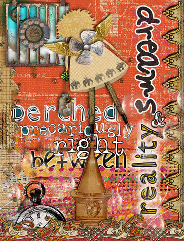
This page by Grace shows us a {sunburst} design placement of the text.
Over the years we've been fortunate to have Julie Ann Shahin share some wonderful art journaling series with the TB&CO readers. We will be re-posting some of them here on this blog. Please note these may be altered from the original posts to update links, provide information on newer programs, etc.
The following is Part One of a fabulous post on typography...
I believe many of us in this industry collect fonts as a passion. Tangie has picked up on this passion when she started her Foundry with her own fonts for sale. Not only that, she has given exclusive video tutorials on how to make the most of these fonts in art journaling to the Art Journal Caravan™ Workshop 2011 (now available as a self-study workshop) to watch at your own pace.
Today let’s look at some of the talented Art Journal Caravan members and Studio Tangie Creative Team members, and how they’ve made the most of typography and font use. We’ll see the use of rhythm, energy, repetition and scale. We’ll see the use of contrasting fonts, casual fonts and fonts used for readability. We’ll see text paths, text circles and fonts that guide your eye through the design. We’ll see fonts that offer mood, hierarchy and emphasis. We’ll see fonts with a crackled effect, decorative fonts and handwritten fonts. Also we’ll see typography and fonts that break all the rules! Here we go….
This page by sparklyduck75 demonstrates creative fonts use with {rhythm}, which is appropriate for the lyrics.
This fun page by Yvonne55 demonstrates a {casual} use of a font mixed with doodling. She’s backed the font with color and patterns.
Credts: Font is Jabberwock by Tangie Baxter, All papers (fillings) are by Tangie Baxter.
This page by jonee uses {contrasting fonts} for ultimate impact.
Credits: Gesso2 by Studio Tangie, ARTistrokes by Studio Ztampf, Femme by Birgit Kerr, Wordstrips by Birgit Kerr, Art Mask Addon by Phuong Ton, Kaleidoscope by Lynne-Marie, creations, Leona Sanford at Catscrap. True to Yourself by Pink Reptile Designs at Zig Zag Scrap. Fonts: You are Loved, Old Typewriter
Quote: source unknown.
In this page by janeagain, the fonts {guide} your eye around the design. The distinctness in font weights help to achieve this effect.
Credits: Dream and Discover, Deconstructed Journals vol. 2 and 3, Steampunk Bandwagon, and Prose by Tangie Baxter Fonts are Five, Seven and Two and Knave by Tangie Baxter and !Paul Maul
This page is an example of giving {personality/mood} to typefaces.
Credits: AJC Parcel 25 by Tangie Baxter and Beth Rimmer; Catch Splatter Graffiti by Tangie; AJC Deconstructed Journals Papers by Tangie; Water droplets from Field Notes: Spring kit by… guess who?; Swirls and leaves from Sweetums Garden by Maya. Fonts: Tangie’s Art Journal Font Chesire and AJF Jabberwock; also 2Peas_Goofball.
This is an example of using a {textpath} or perhaps distorting the text path by Serenoa.
Credits: Elements and papers from Tangie Baxter kits – Golden Ocean, Briny Deep, Seaside Art Dolls, and Parcel 22.
This is a beautiful page showing a bold font with a {crackled effect} by jonee.
Credits: Splatter Grafitti Celtic, AJC 11, AJC 33 by Tangie Baxter. She Follows her Heart by Studio Rosey Posey, Gypsy Rose collab by Studio Rosey Posey and Gypsy, Naturally by Pink Reptile Designs, Creation 23 by Catherine Designs and Createwings, ReCreation 23 by Catherine Designs and Createwings, Natural Abandon by Gypsy, Cozy by Lynne-Marie, Quote by Rabindranath Tagore, Font (with effect) Cracked.
This page by DALE shows us a {decorative} font from Tangie’s foundry.
Credits: Tangie Baxter's Knave Font (just love it!!), Rebecca McMeen's Merrit. Studio Lori's Artist Faeries.
That's the end of part one. Please join us next Flashback Friday for more fun with typography!
Tangle patterns are a great thing to add to your doodling repertoire in art journaling. There are also many tutorials and patterns with instructions online if you wish to explore further. I used some of these patterns on an art journal page that I’m going to show you today as the page progressed in stages.
First I started out with a vintage book page that I had previously misted in two colors.
Second, I used a pencil to doodle a border around the edges of the page which would be for my text.
Third, I penciled in my journaling and drew a heart.
Fourth, I used a fine point marker over the journaling. Then I did my first tangle pattern (Yincut)on the heart. If you would like to see the pattern instructions for Yincut as I did it in the heart, you can find it here. It is also found on the Official List link above.
Fifth, I penciled in houses along the bottom border. I added swirls. I added a Zentangle border called XYP along the top.
Then I had fun with a pattern called Finery in the upper left corner.
Then, I filled in the area around the butterfly in the upper right corner with a pattern called Bales.
The middle house roof was filled with a pattern called Keeko.
“I used Art Rage on my iPad to draw my tangle — its the square in the center. I also used several Gessos and the Gesso styles by Tangie and the rest of the items were created by Nicole Young. This was lots of fun to do. I played with making it all white and Black, but liked the splash of yellow.”
Handy by huntstrong
'I traced my hand with a black Sharpie marker, then divided that shape with horizontal and vertical wavy lines. Then I zentangled away the day!”
Mandala #1 by php57
“Drawn with my Wacom tablet – contains the letters of my nickname.”
zendala by Nevermore
"Y’all know I love to ramble on. So, I have never done a zendala before so I did download and use Genevive Crabe’s Template 1. Printed it out on cheap photocopy paper and started in with a cheap ballpoint pen. Sadly, by the time I thought I was going to use it, it was finished. Ideally, would have liked this on good paper with a decent pen. Scanned it in and put it on a Berna Datema “Lucky Bucket” paper with a little filtering (colour overlay, match colour, find edges, layer blending) and a good ol’ 60s message created with Michelle Godin’s “I met a Boy” cardboard with lettering done in ArtRage, finished off with Tangie’s worn paper style to make the letters crease nicely where the cardboard is creased. For those addicted, official Zentangle patterns mookah and between were used, the rest is just doodling."
Today I am sharing with you a tutorial for using Printables as promised last week. I will create a hybrid Art Journal page with Border printables. I love Tangie’s Borders! I have for you a two-part video tutorial, and also the same tutorial posted in step-by-step photographs below. Watch the video or check out the written tutorial, or both!!!
TUTORIAL PART 1
TUTORIAL PART 2
WRITTEN TUTORIAL
1. Start with a roughly painted background. Adhere vintage pattern tissue paper with gel matte medium. Dry with heat gun.
2. Mix gel matte medium with a bit of white acrylic craft paint. This makes the white paint transparent. Paint over the tissue paper. Dry with heat gun.
3. Cut out Collage Fodder Head Printable and adhere to page with gel matte medium.
4. Draw journaling lines with a fine tip marker or pen.
5. Adhere large border pieces with gel matte medium. (photo below)
6. Adhere Dominoes Collage Printables with gel matte medium. (photo below)
7. Write the journaling “Don’t forget to be awesome!” Outline it with black. Start to outline the borders and add dots.
8. Finish with more dots and adhere a butterfly punch to the page. Enjoy your completed art! xoxo
The Collage Workshop materials need to be downloaded before the end of each month so there's only a few days left to join the AJE and get this month's workshop.
For a look at all the different subscriptions available HERE.
Select option A through E to get the digital version of the collage sheets (option C includes printed collage sheets mailed to you) or Option I to have access to the printed collage sheets ONLY mailed to you.
Over the years we've been fortunate to have Julie Ann Shahin share some wonderful art journaling series with the TB&CO readers. We will be re-posting some of them here on this blog. Please note these may be altered from the original posts to update links, provide information on newer programs, etc. Welcome to Flashback Fridays! Enjoy!
Art Journaling 101: Why Art Journal?
by Julie Ann Shahin
You may have heard of Art Journaling and have wondered “what is all the fuss? Why should I Art Journal? What will I get out of keeping an Art Journal? I’m already a ( ____”insert noun here such: as scrapbooker or a card-maker or an artist or a photographer___), why should I try this as well?” Let me give you 3 reasons to Art Journal.
“Creativity often consists of merely turning up what is already there. Did you know that right and left shoes were thought up only a little more than a century ago?”
-Bernice Fitz-Gibbon
2011 Art Journal Caravan Itinerary #20: Understand by Julie Ann Shahin
1. ART JOURNAL TO EXERCISE YOUR CREATIVE MUSCLES
I believe anyone who wants to exercise their creativity muscles can benefit from keeping an art journal. Just like any other muscle, if you don’t use it often, it will get weak. If you don’t have time to work on your normal project, you can whip up a quick art journal page just for the fun of it to keep your creative juices flowing.
If you have been scared to try a new technique, an art journal is the place to do it.
2011 Art Journal Caravan Itinerary: Reinforce by Jo aka Spunmonkey
Where a scrapbook or a card may have a certain style to it, an art journal can get as messy and as ugly as need be as you explore in it. This is the place to experiment if there is no other place. One such resource for encouraging you to try new things is the book Wreck This Journal by Keri Smith.
If you are interested in learning new techniques in both digital and hands-on art journaling via online video instruction by Tangie herself, you will be treated to such delights by joining the Art Journal Caravan. Also, you can watch Tangie on YouTube here .
2. ART JOURNAL TO GIVE YOURSELF A VOICE
Some people like to write in their art journals as a diary and add illustrations to it. Some like to use their art journal for their favorite affirmations or quotations. Some like to use their art journal for cathartic emotional healing.
2011 Art Journal Caravan: Itinerary - Paused by JoAnn aka joannknnrd
Often it is helpful to find creative prompts that will jump-start your journaling in this process. Whether you google art journaling prompts or decide to join and use the Art Journal Caravan Itinerary Prompts that are part of the weekly deliveries.
3. ART JOURNAL TO PLAY
If I haven’t convinced you so far, then perhaps just the sheer joy of “PLAY!” is a good reason to crack open an art journal, and just have at it.
Do you have scheduled “Me” time?
Is your scrapbooking or other craft-time really “Me” time or are you doing it for others, are the pages about you or about the ones you love? Is it really “PLAY”?
When was the last time you totally lost track of time in free play?
2011 Art Journal Caravan Itinerary: Travel by Jo aka spunmonkey
Art journaling gives you PERMISSION TO PLAY! Yes, we, as adults, have a need to play just as much as children do in the goal of living a balanced life. “Grown ups forget to play. But play, it turns out, is just as important for adults as it is for children. Adults spend too little time at play according to research, and would benefit greatly from spending more time at it.” (Source: Dr. Tian Dayton)
2011 Art Journal Caravan Itinerary #2: Thrive by Julie Ann Shahin
Play gives you a chance to have a break from your everyday “role” as a businessperson, Mommy, Daddy, etc., and have a chance to take on a different role – here for example, as an artist. Plus you get to experience such positive feelings as:
Involvement
Complete focus and concentration, either due to innate curiosity or as the result of training.
Delight
A sense of bliss and positive detachment from everyday reality.
Clarity
Great inner clarity and a built-in understanding about the state of affairs.
Confidence
An innate sense that the activity is doable and that your skills are adequate to the task. Additionally, you don’t feel anxious or bored.
Serenity
A sense of peace and an absence of worries about self.
Timeliness
Thorough focus on the present and a lack of attention to the passing of time.
Motivation
Intrinsic understanding about what needs to be done and a desire to keep the moment of play moving.
Art journaling gives you a chance to practice new techniques, speak your mind, and just have fun. If this sounds like something you would like to start now, you can join us at the Art Journal Caravan.
We hope you enjoyed our first Flashback Friday post.
Tangie Baxter & CO’sArt Journal Caravanis back for 2016 and we’d love for you to join us on the adventure!
You can also find previous years as self-study workshopshere.


 Credits: BG and elements Happy to Be Me by
  Credits: Swirl Brush by KPeriet, Chicken (unknown); Font:
  Credits: image designed by me on Marvel.com, recolored in PhotoshopGlitter: Trixie ScrapsBackground: Tommys Garage by Studio Gypsy; Fonts: Pea Tonya, Pea Danley,Pea NJH Script, Pea Chit’s Bits, Pea Bhea Script, & Pea Teran from Fonts for Peas.
  Credits: