Flashback Friday-Art Journaling 101: Creative Use of Typography in Digi Art Journaling-Part 2 May 27 2016, 0 Comments
Over the years we've been fortunate to have Julie Ann Shahin share some wonderful art journaling series with the TB&CO readers. We will be re-posting some of them here on this blog. Please note these may be altered from the original posts to update links, provide information on newer programs, etc.
The following is Part Two of a fabulous post on typography. If you missed Part One you can read it here. Enjoy!
I believe many of us in this industry collect fonts as a passion. Tangie has picked up on this passion when she started her Foundry with her own fonts for sale. Not only that, she has given exclusive video tutorials on how to make the most of these fonts in art journaling to the Art Journal Caravan™ Workshop 2011 (now available as a self-study workshop) to watch at your own pace.
Today let’s look at some of the talented Art Journal Caravan members and Studio Tangie Creative Team members, and how they’ve made the most of typography and font use. We’ll see the use of rhythm, energy, repetition and scale. We’ll see the use of contrasting fonts, casual fonts and fonts used for readability. We’ll see text paths, text circles and fonts that guide your eye through the design. We’ll see fonts that offer mood, hierarchy and emphasis. We’ll see fonts with a crackled effect, decorative fonts and handwritten fonts. Also we’ll see typography and fonts that break all the rules! Here we go….
The typography on this page by SpunMonkey creates {energy}.
 Credits: Tangie Baxter's A Door Just Opened, Fonts- Mock Turtle, Walrus (included in the Fontastic Grab Bag) and Paperworn Art Styles & Bonus Action
This page by joamosatcharterdotnet demonstrates several typography details. One is {scale} as the fonts go from larger to smaller to create heirarchy.
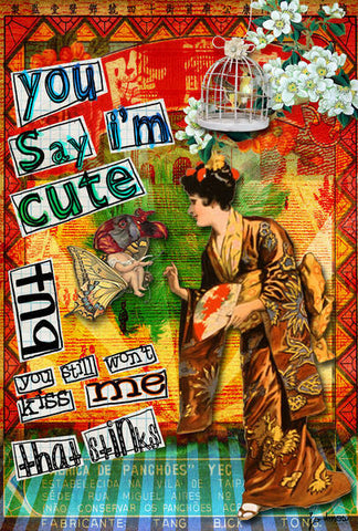
Credits: Tangie Baxter's AlteredArt Sheet65, She Journals Kit, Fonts- Mock Turtle, TweedleDee and Dinah (included in the Fontastic Grab Bag); TumblefishStudios-East is West Extras and Juno-Note Paper Oldies
This page by Tangie Baxter {breaks all the rules}. She flips words along the same line. She also outlines fonts and fills in the centers of certain letters.
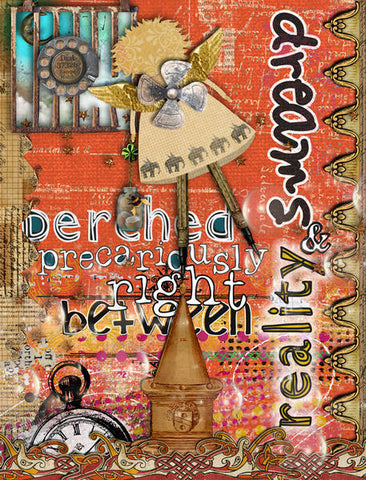
Credits: Tangie Baxter's Compendium of Daydreams(included in The Vault), daydream & pause splatter graffiti, Celtic Traditions (included in The Vault), Call of the Gypsy, Fonts-Dodo, Mock Turtle, Plum Pudding, Tweedledum (included in the Fontastic Grab Bag); Rebecca McMeen's Merritt; Metal Momma by Holliewood Studios
This page by Grace shows us a {sunburst} design placement of the text.

Credits: Tangie Baxter's Parcel 30 Gesso Textures and Parcel 31 Gesso 2 (included on AJC Workshop 2011 Parcel Bundle), Fonts- Dinah, White Queen and Mock Turtle (included in the Fontastic Grab Bag), Paperworn Art Styles; Rebecca McMeen's Whim and Eliaz
That's the end of part two. Please join us next Flashback Friday for more fun with typography!
[posted by: Joy]
