Doodle Extraction Made Easy April 28 2016, 3 Comments

Do you doodle? I do love a good doodle! Over the past year I've seen the doodle and hand lettering genres just explode across the Internet. Don't get me wrong, I am a sucker for a great font, but there's nothing quite like adding that special, personal touch to your digital art journal.
Would you like to join the trend, but are not sure where to begin? You've come to the right place! As I promised last week, this tutorial will take a quick and dirty approach to making your pen and ink lettering/doodling an integral part of your digital art.
As always, my disclaimer is as follows: Adobe Photoshop is a powerful piece of software and there are many different ways to get results, this just happens to be the best way that works for me at this time. This tutorial is written for the PC using Photoshop CC, if you are on a different operating system or version, there will likely be differences. And now... on to the fun!
The first step, of course is to doodle your doodle. For this example I will use some hand lettered words from last week's art journal page. Since I'm not a super-pro hand letterer, I traced the words out in pencil first and followed up with a brush pen.
I use an Epson XP-410. It's nothing fancy, but it does the trick, especially for small personal projects like this one. I like to scan my work at at least 600 dpi. You can probably get away with scanning your image at 300, but I like to have some leeway in case I decide to re-size my image.

This is what my original image looks like after scanning. Pretty rough stuff, huh? Don't worry, we'll clean this puppy up in no time!
I make it a habit of duplicating my original image {CTRL+J} in case I mess it up and need the original again.
(Looking for more awesome keyboard shortcuts that every digital artist should know? Check out these time saving tips!)
First, I like to run a threshold adjustment layer.

This option creates a strict black/white effect that knocks out colors and hues of gray, which helps in my image extraction process. Your threshold levels will depend on your image, but for this piece mine looked like this:

Here's what my image looked like after I adjusted the threshold:

After merging the threshold adjustment level down on to my image, the next step is going to be to select your words. There are several different ways to go about this and how you approach it will depend on the image you are working with as well as personal preferance.
One of my favorite methods of selection, especially when working in black and white, is Color Range (Select --> Color Range...)

This option is a little-known magic trick that allows you to select only the range of colors you choose. Awe. Some. This option has a ton of uses and therefore lots of options to choose from... which I will happy to delve into at a later date.
However, due to the nature of this particular doodle, I chose to go with the old fashioned Wand tool {W}. I selected all the white space around my image, making sure to uncheck contiguous first.
![]()
Once the image is successfully selected, I usually make the following adjustments, though they can change on a case by case basis:


Select --> Modify --> Expand... (note: you would use contract if you went with the Color Range option)
I usually expand anywhere from 1-3 pixels, depending on the weight of the image and how much I want to trim away.


Select --> Modify --> Smooth...
I generally choose 2 pixels here.


Select --> Modify --> Feather...
This option will range from about .5 to .2 for me.
And lastly, you're either going to want to delete the background of the image {backspace}, or inverse the selection {CTRL+SHIFT+I} and create a new layer from it {CTRL+J}. Ta da!
The result may not be the perfectly clean and precise extraction that you might get from using the pen tool, but I assure you this way requires much less work and for the purposes of some down and dirty art journaling, it will surely do the trick!

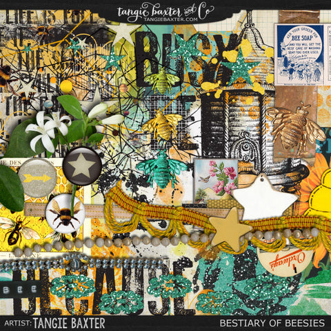
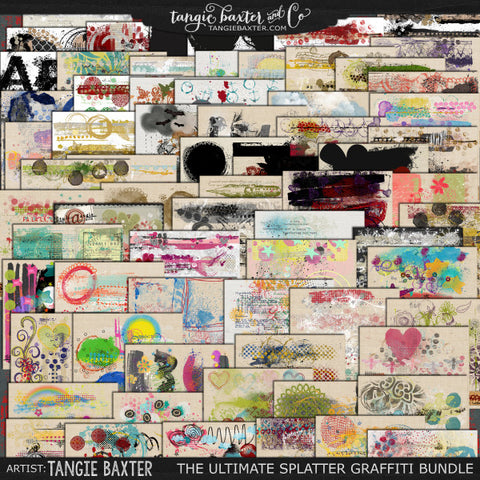
And that's it! Now you have a beautiful, polished graphic to use at your will. I used this particular lettering in my latest digital art journal page:

{credits: Bestiary of Beesies, The ULTIMATE Splatter Graffiti Bundle, Bountiful, Envelop {Tangie Bundle No. 19} by Tangie Baxter}
I've come to realize that this process takes far longer to explain than to execute; once you've tried it a few times you'll see that it's easier to do than you think. An average simple extraction of this nature only takes me a few minutes now that I've found my flow.


Comments
satyam kushwaha on September 03 2025 at 02:22AM
animation type doodle
Karli-Marie on May 01 2016 at 11:41AM
I’m honestly not sure Susan! If you give it a try, let us know & I can update the tutorial with your outcome :)
susan on May 01 2016 at 10:36AM
very cool…do you know if the process is similar for PSE 7 users?